

Lark & Vines: Brand Identity
Hello everyone! It has been a minute since I have posted a blog update! I am so excited for this one as I have been working on if for a while now. Now that it is finished I am excited to share! Lark & Vines is a home goods store opening up June 15th, in Fairview Park OH. One of my old co-workers and friends Leslie Choma is the owner of the business, and this is her vision I was so lucky to be able to bring to life.
Leslie came to me with a fantastic concept, and business model that really resonated with me. I think one reason why the outcome is fantastic is because of that solid idea, and reason behind the brand. I truly had a lot of fun working on this project and I hope you all have fun checking it out. I will be posting another blog post after the store opens with updates, and an interview with Leslie on her store, and brand. If you live in the Cleveland area and are able to go check out Lark & Vines June 15th, please do!
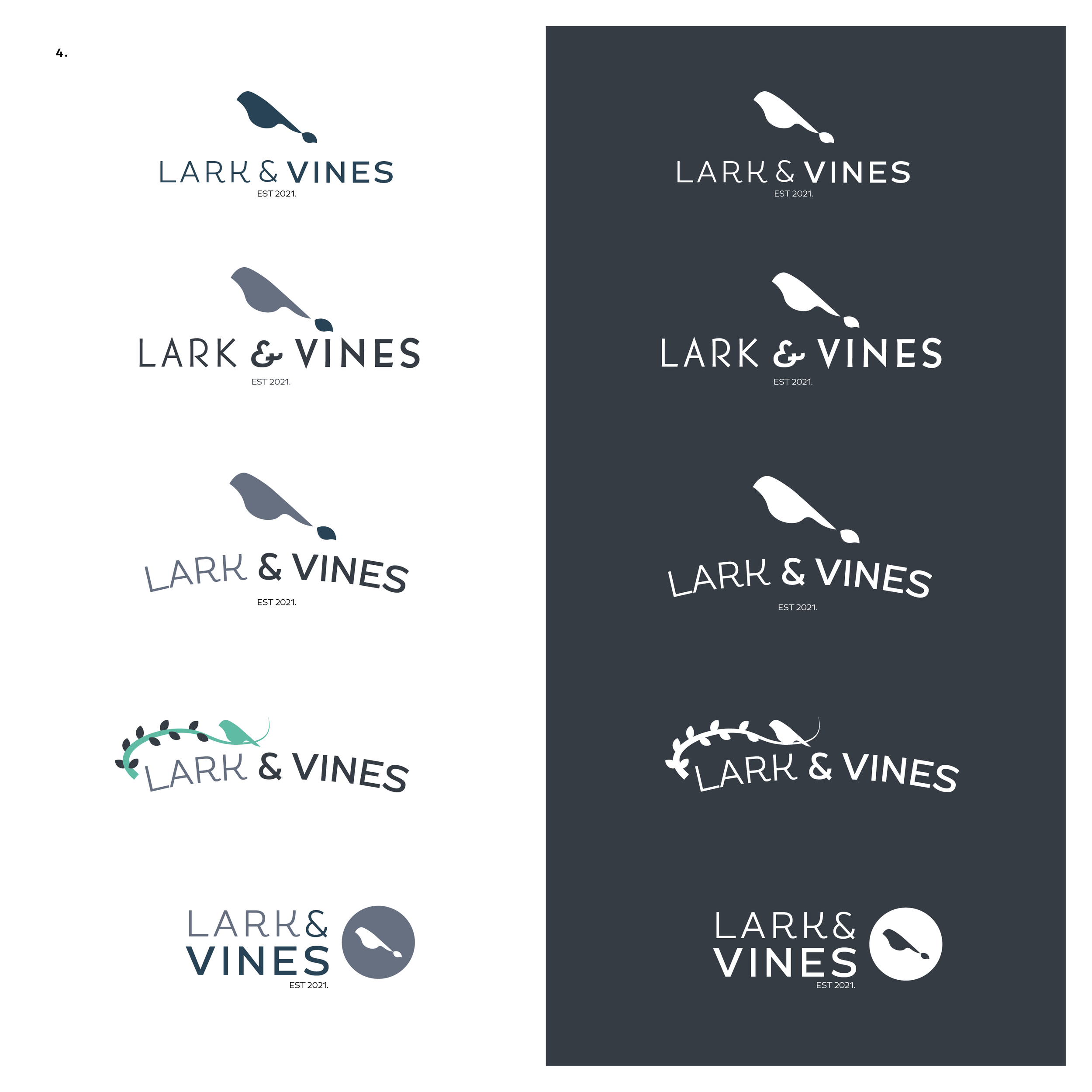
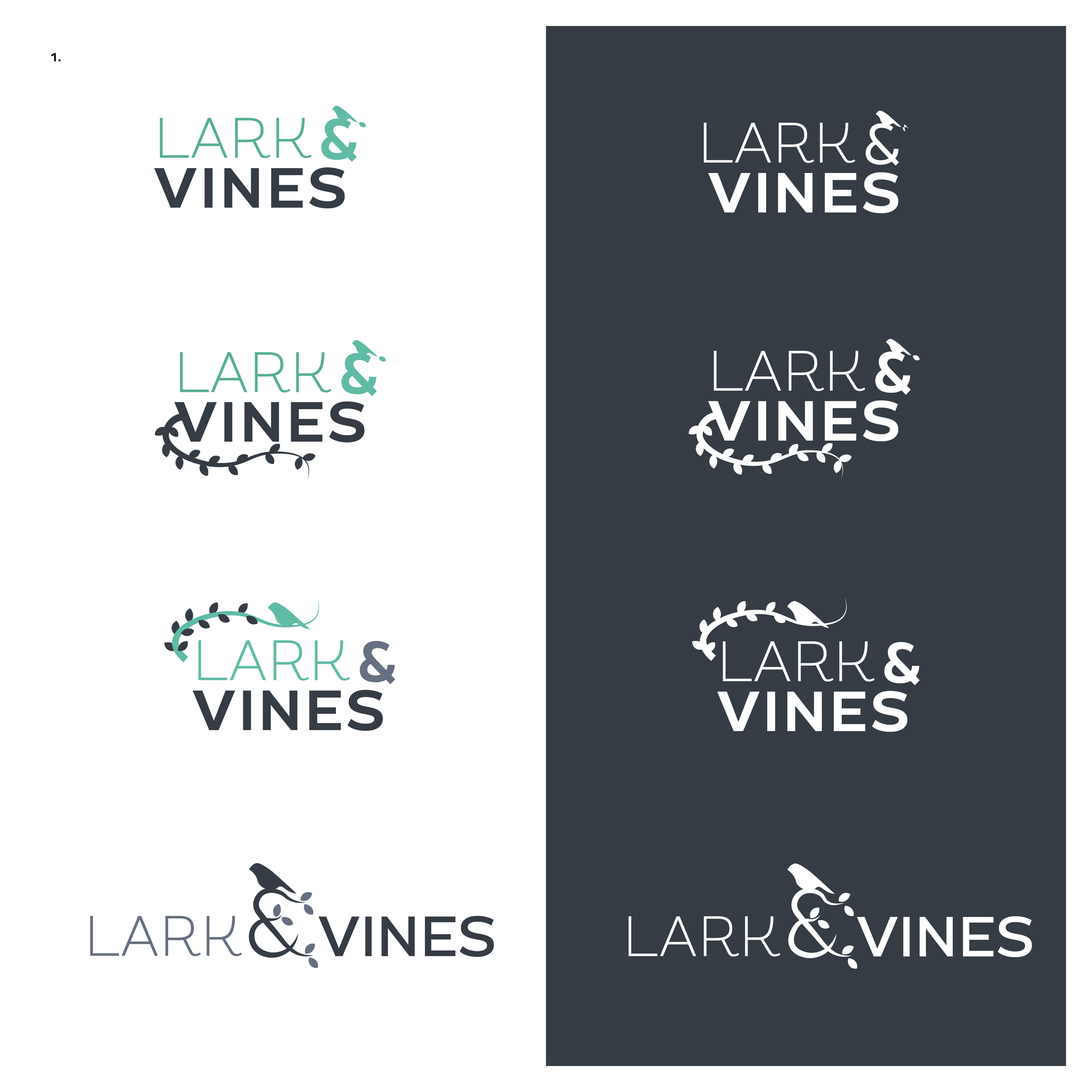
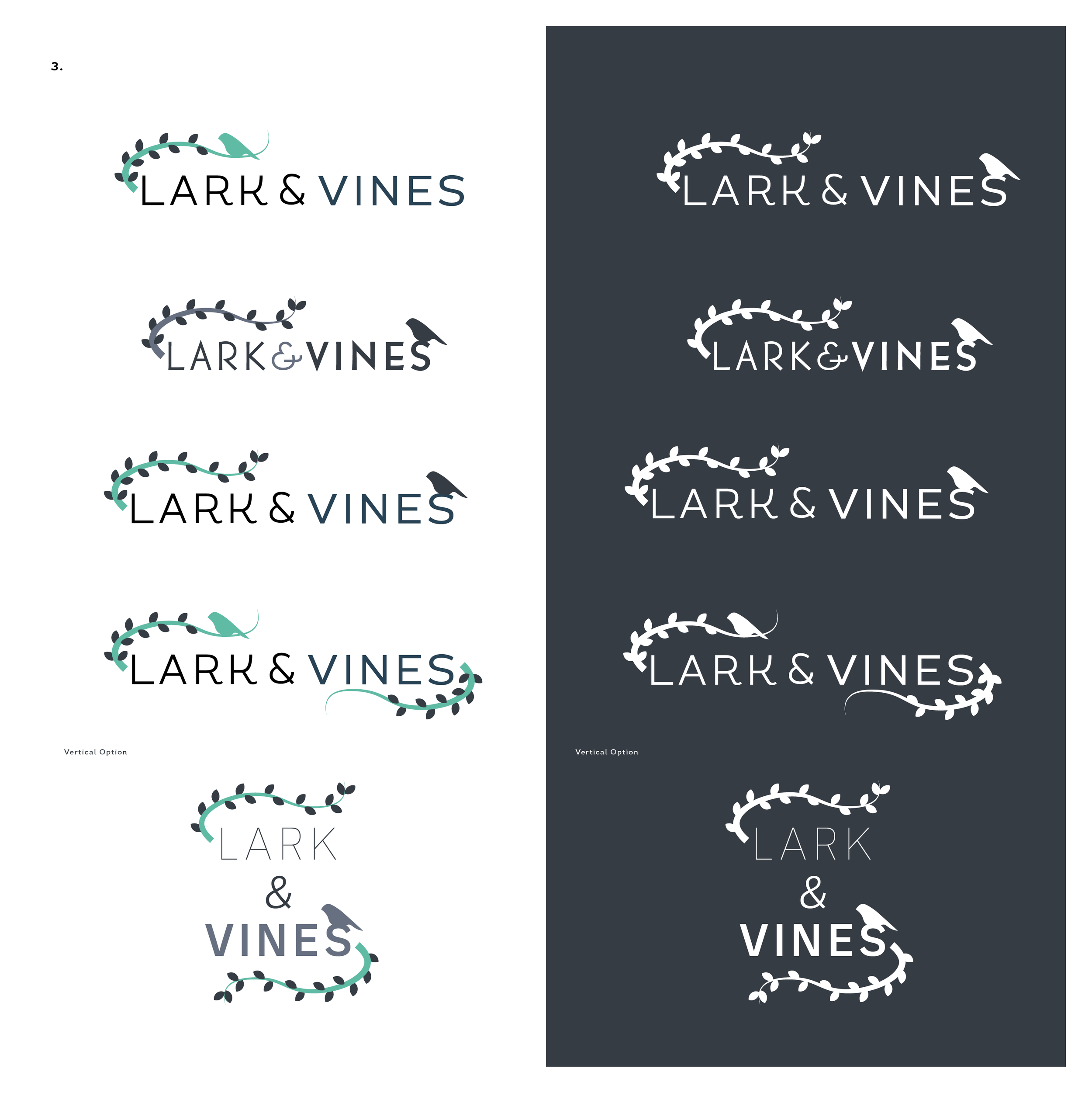
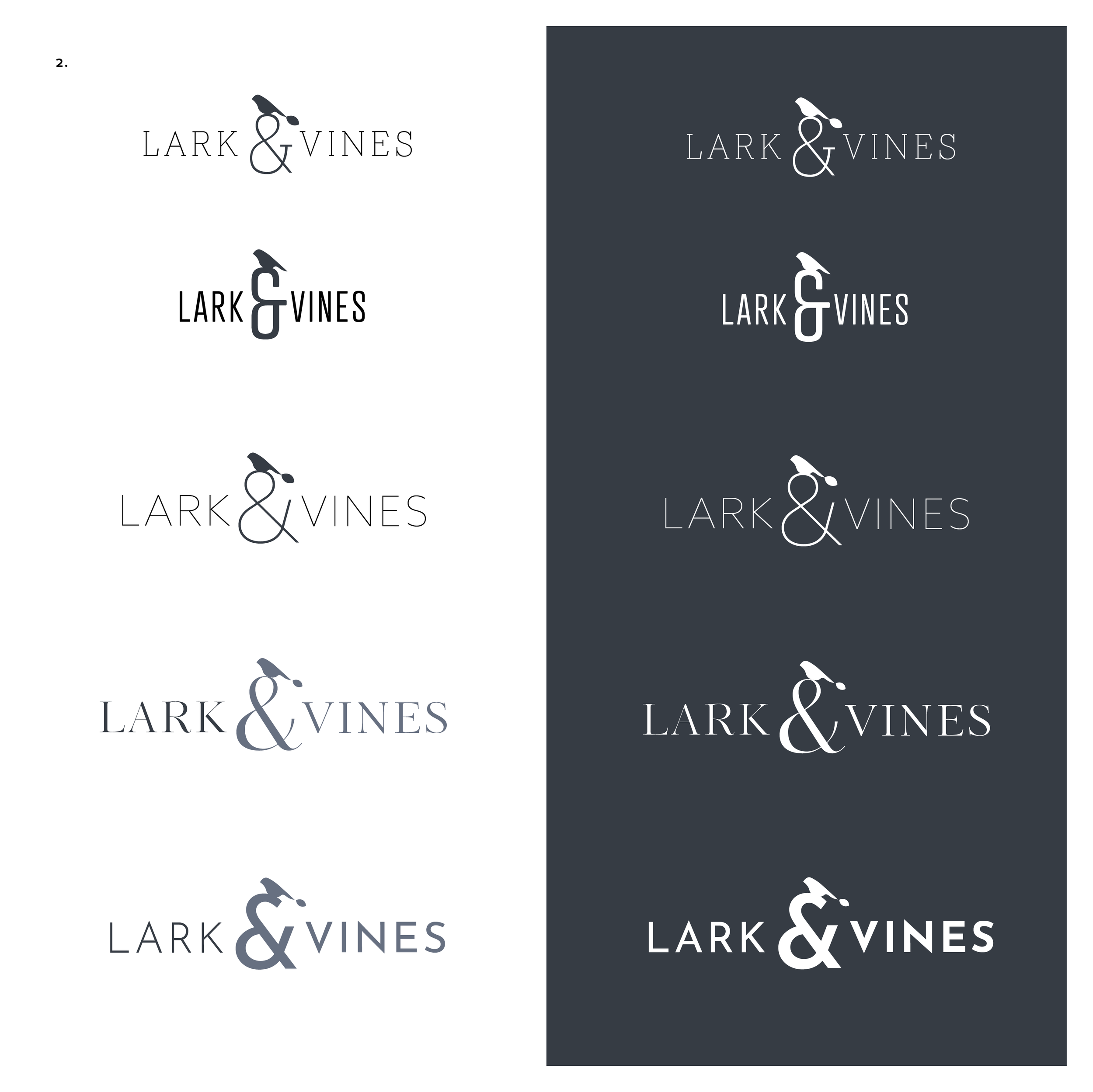
Logo Variations
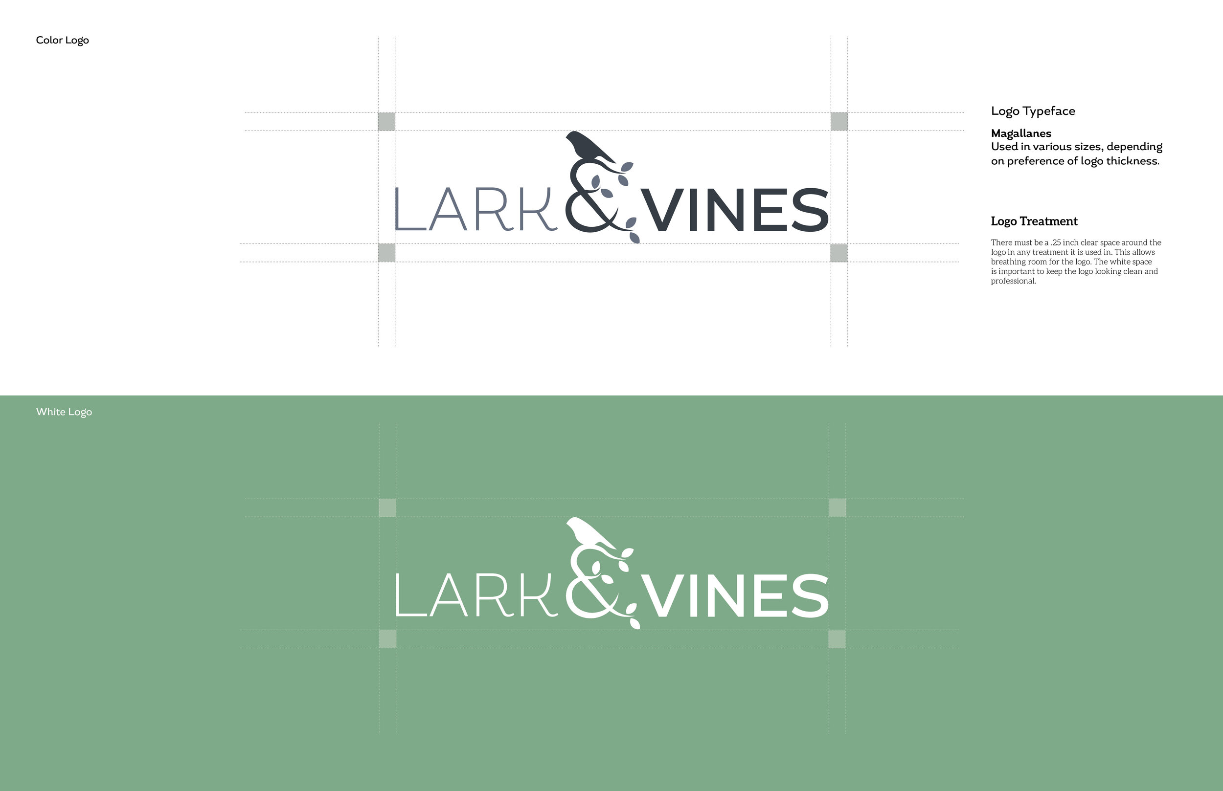
The final logo for Lark & Vines is pictured above, but designing the logo was quite fun. I think the final logo has a nice balance of organic shapes, and visuals, that showcases the vibe of the brand well.
Usually when I share drafts to a client it is not this many, but I had a lot of fun playing around with the logo and wanted her to see the variety and make a choice for what was best for her business. These were refined from the 1st drafts sent over, and while I saw many that could be the final logo design, the final one speaks to the brand perfectly.
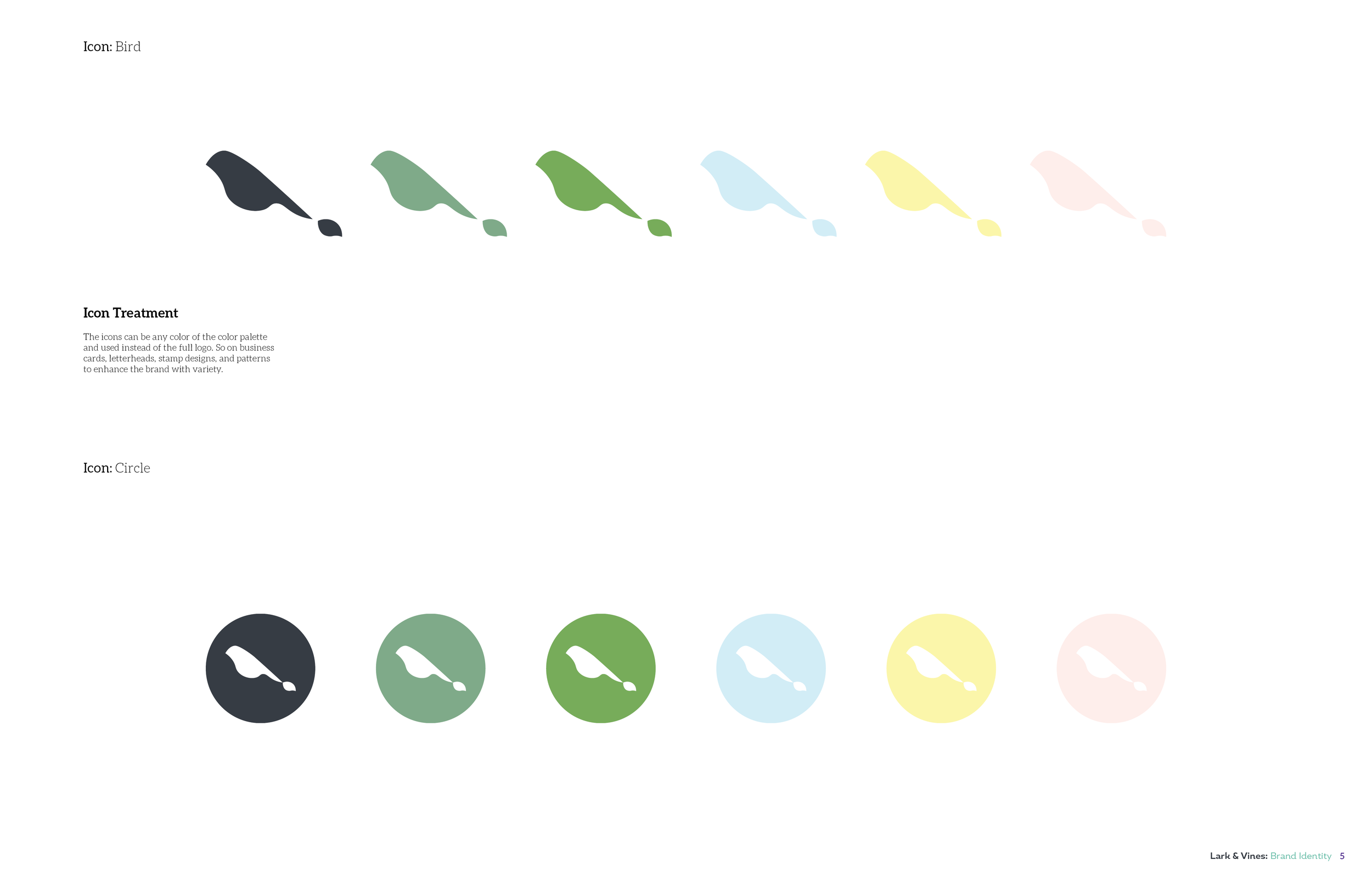
Icons


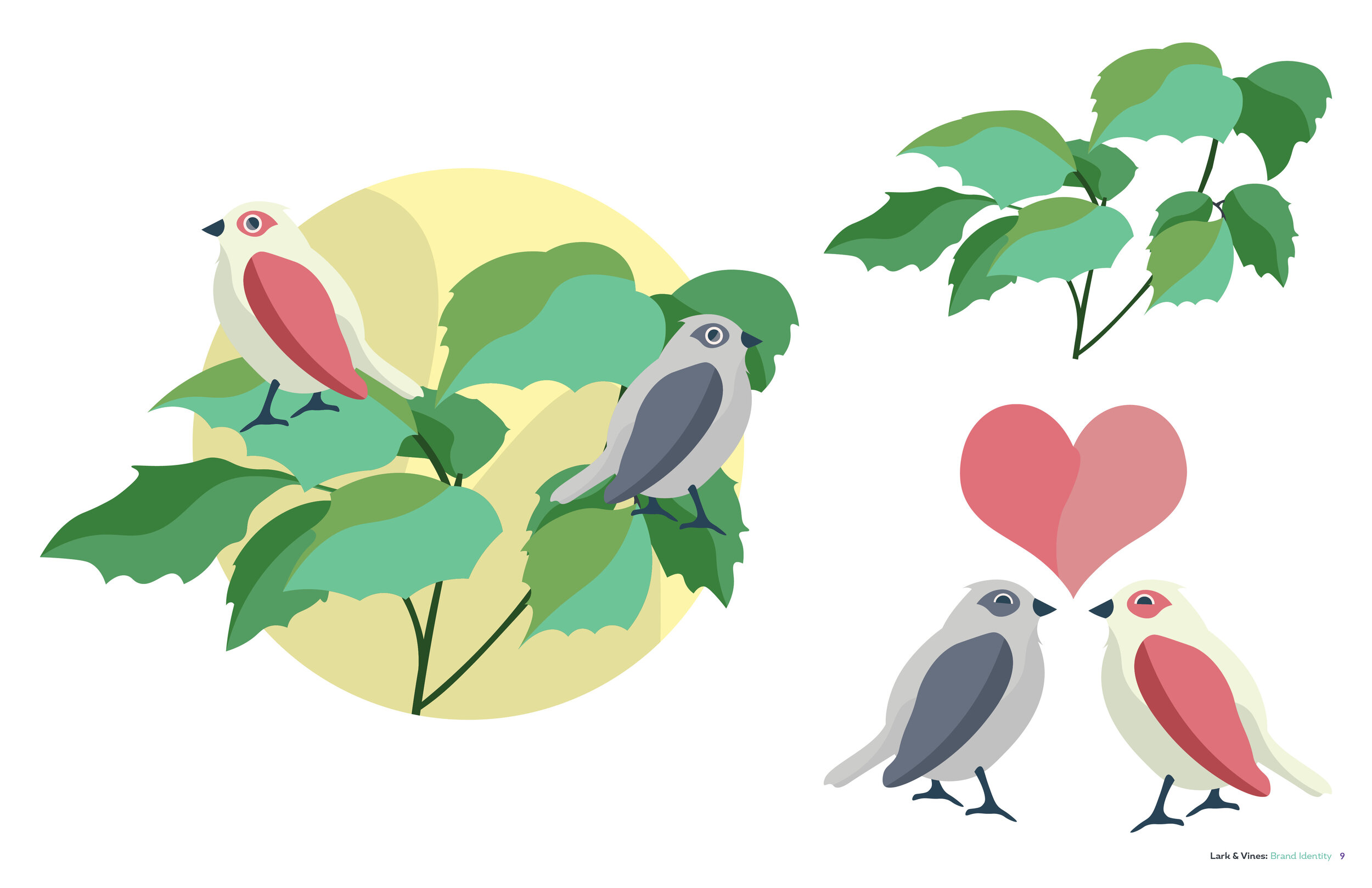
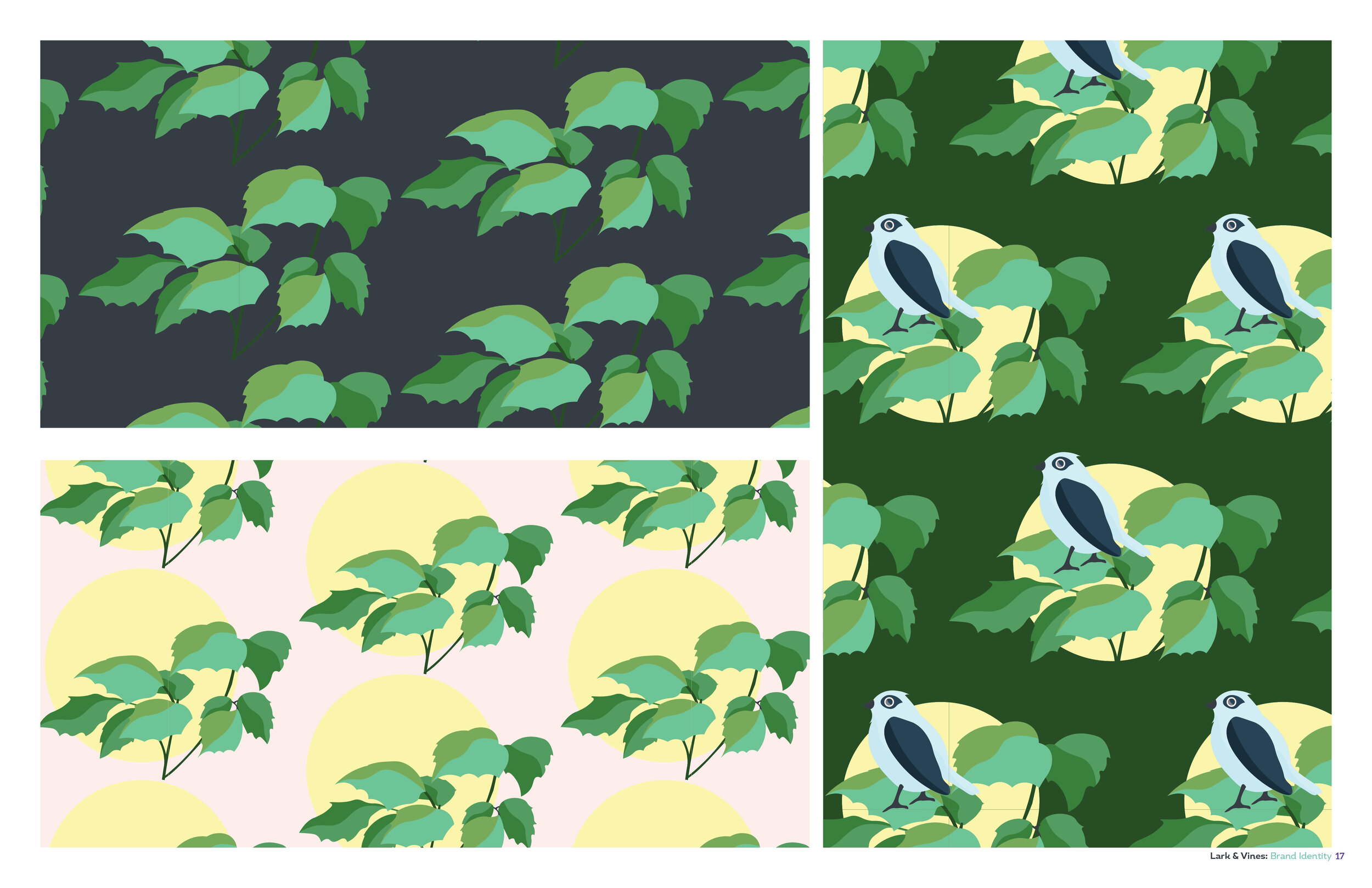
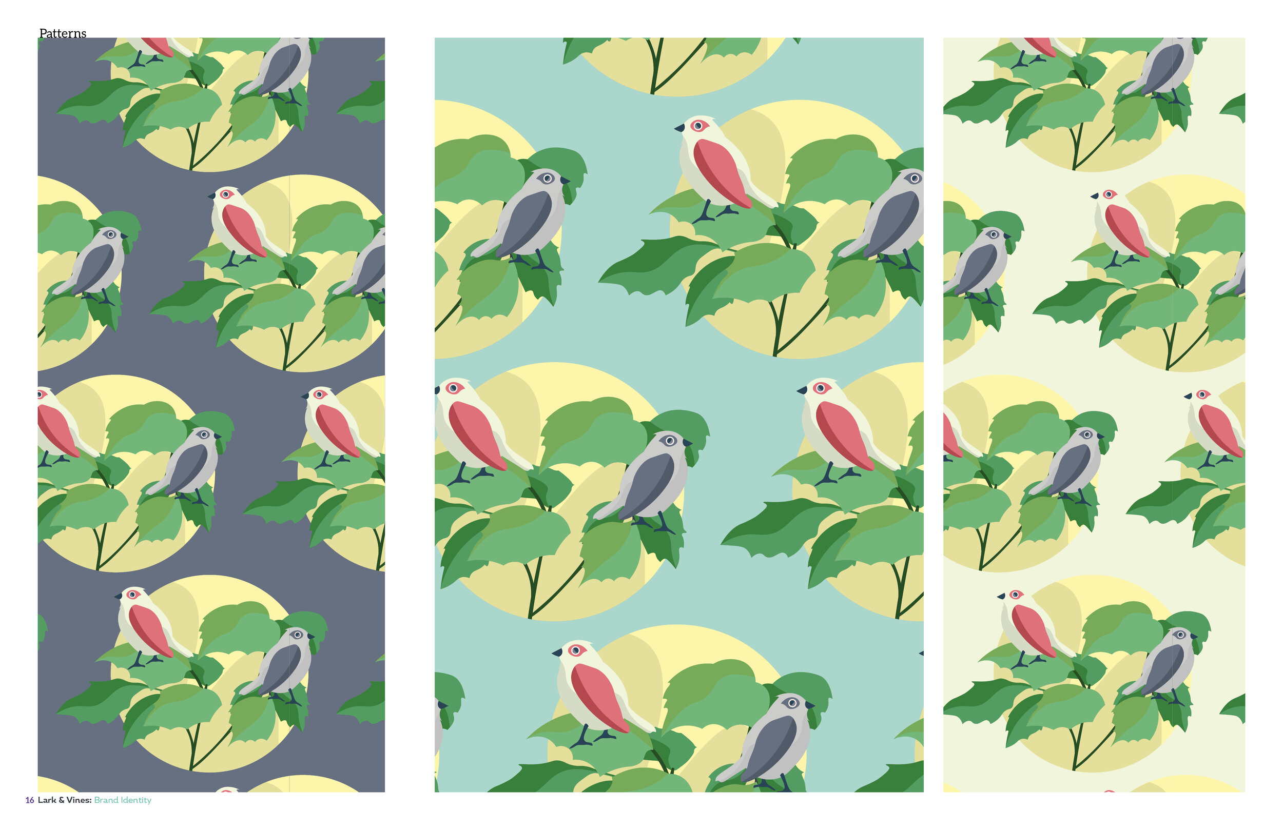
Illustration
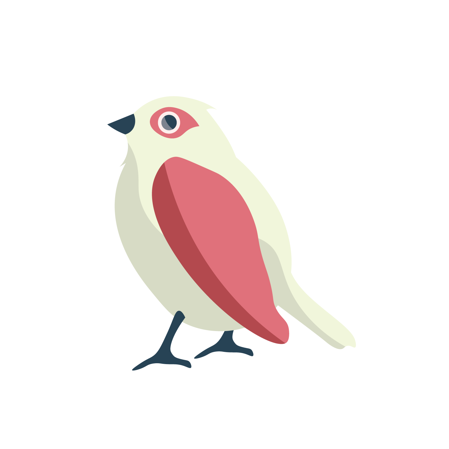
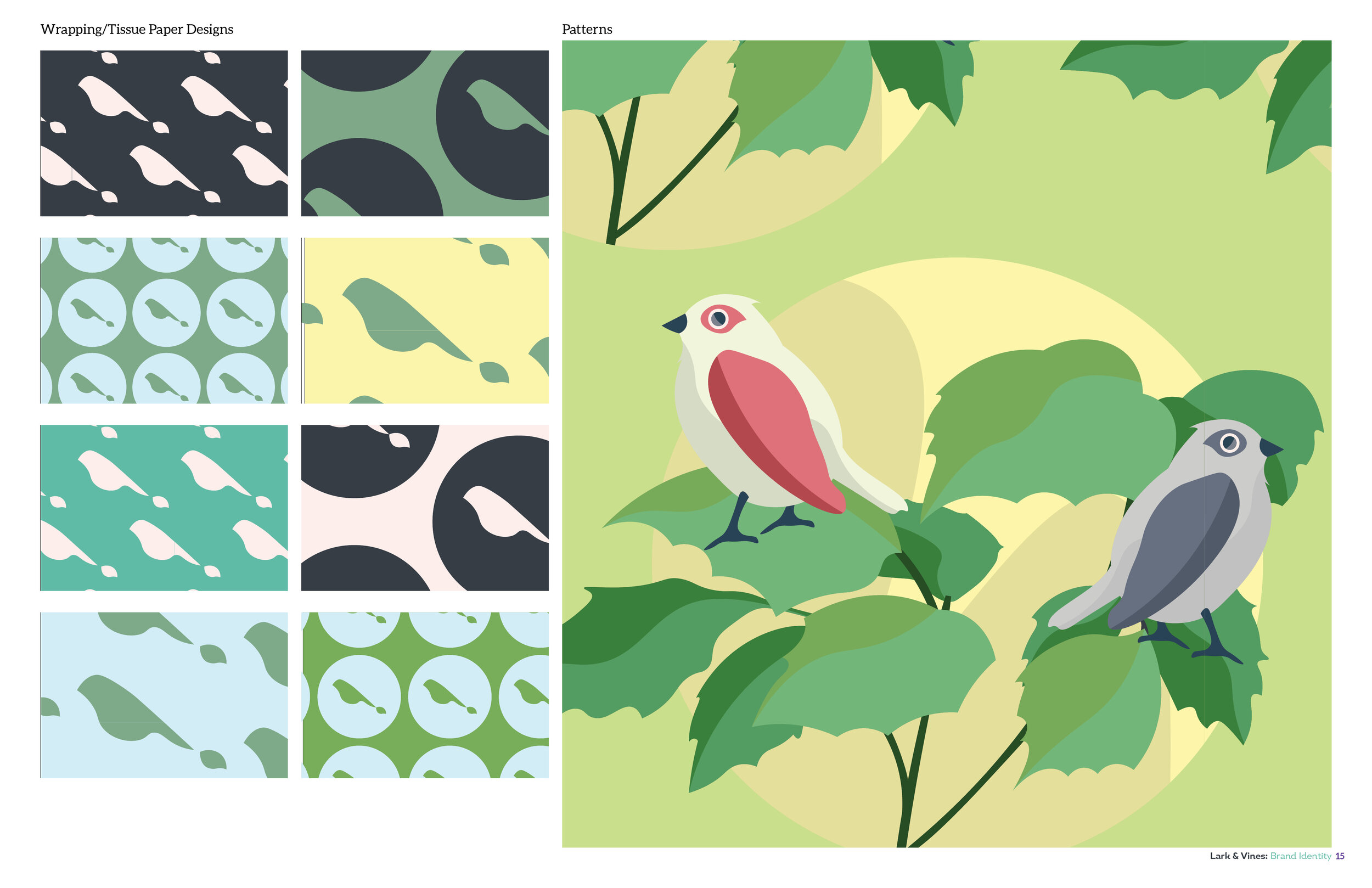
I had a lot of fun illustrating the larks, and their vines. The vines were taking from photos Leslie provided of vines her mother and grandmother gave her. This was a nice touch to tie in a personal meaning to a design, that also plays a part in the meaning behind the brand as well.

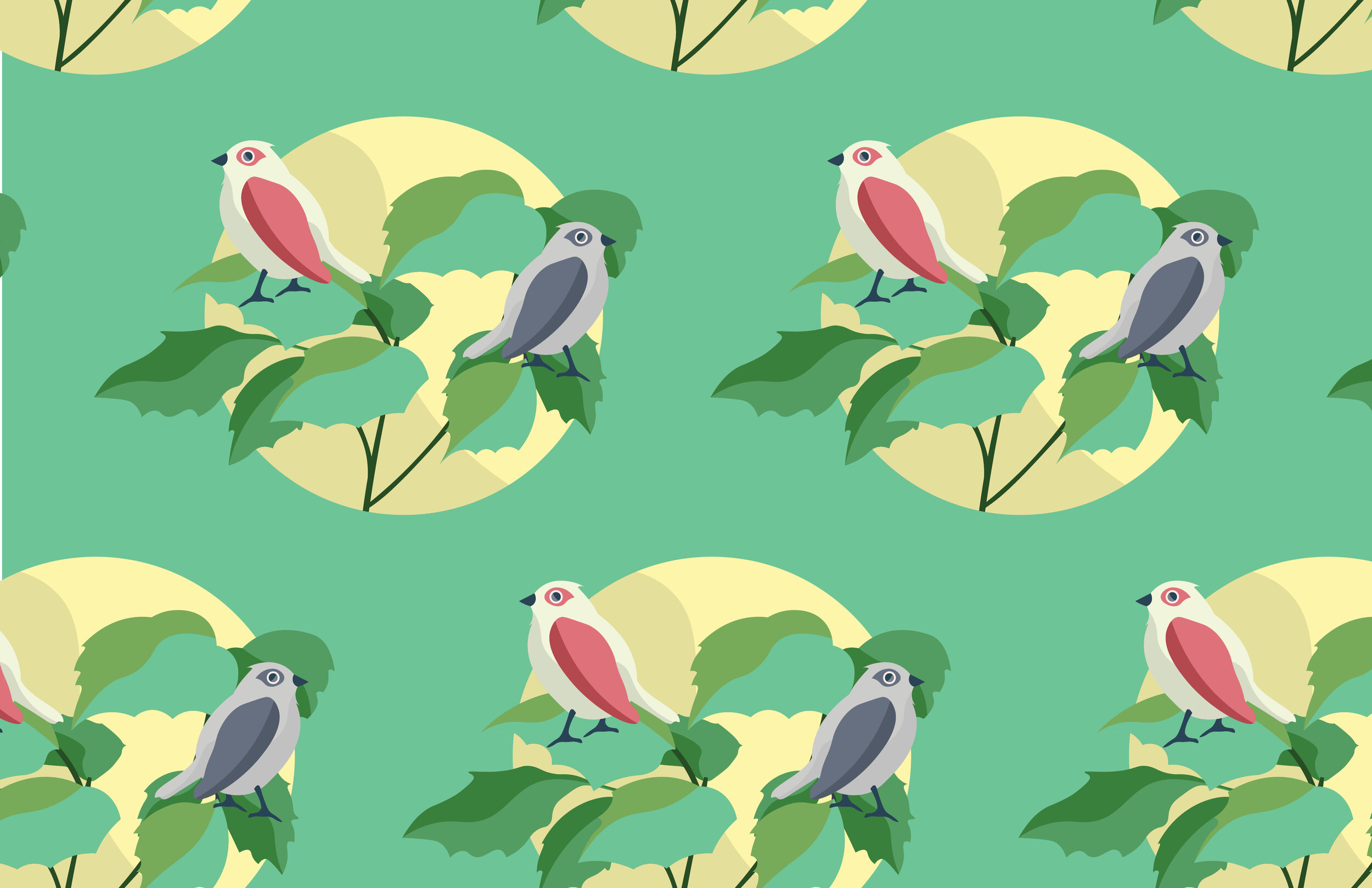
This is the main graphic is utilized in the patterns designed for the business.

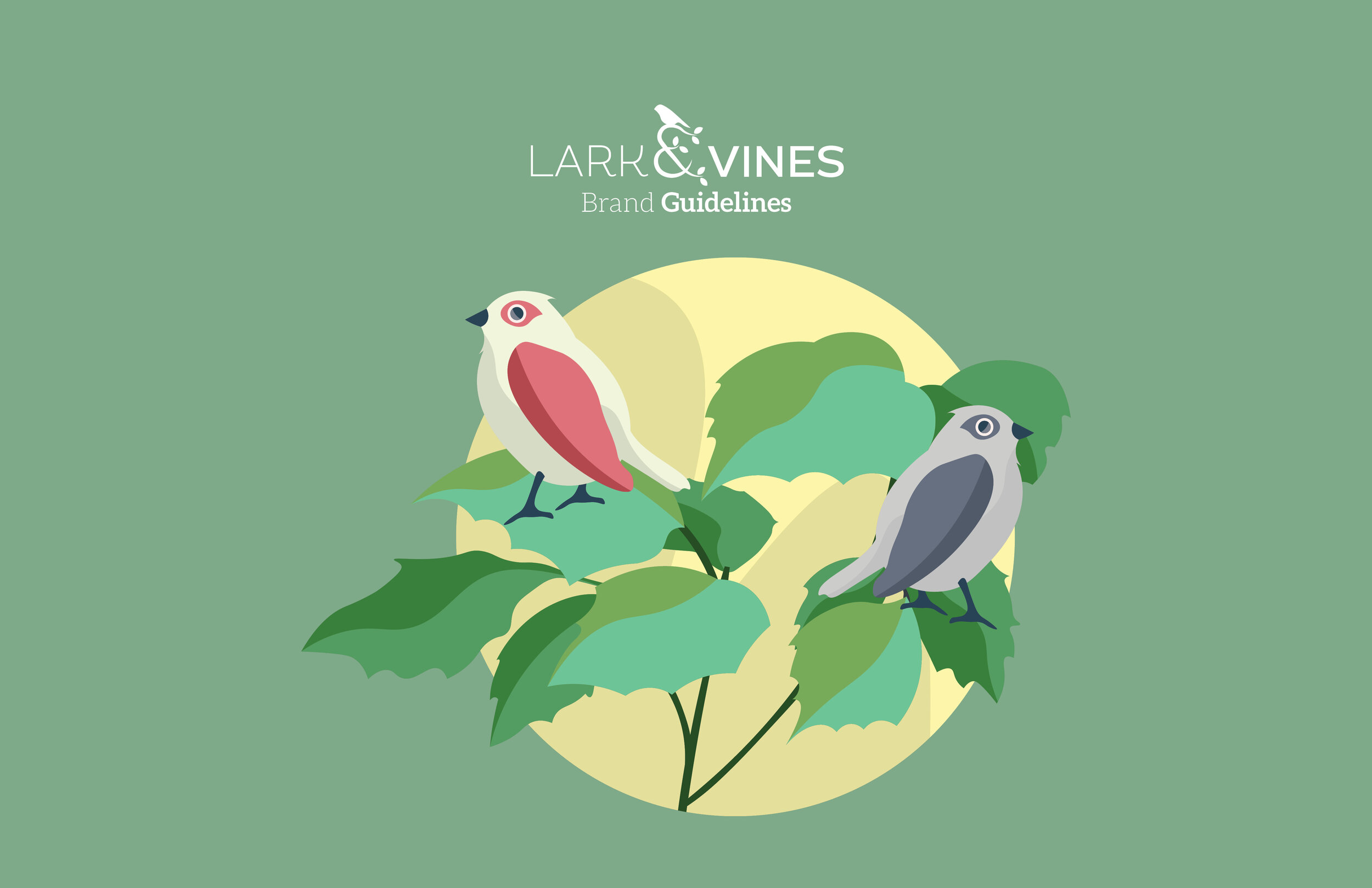
Love Birds


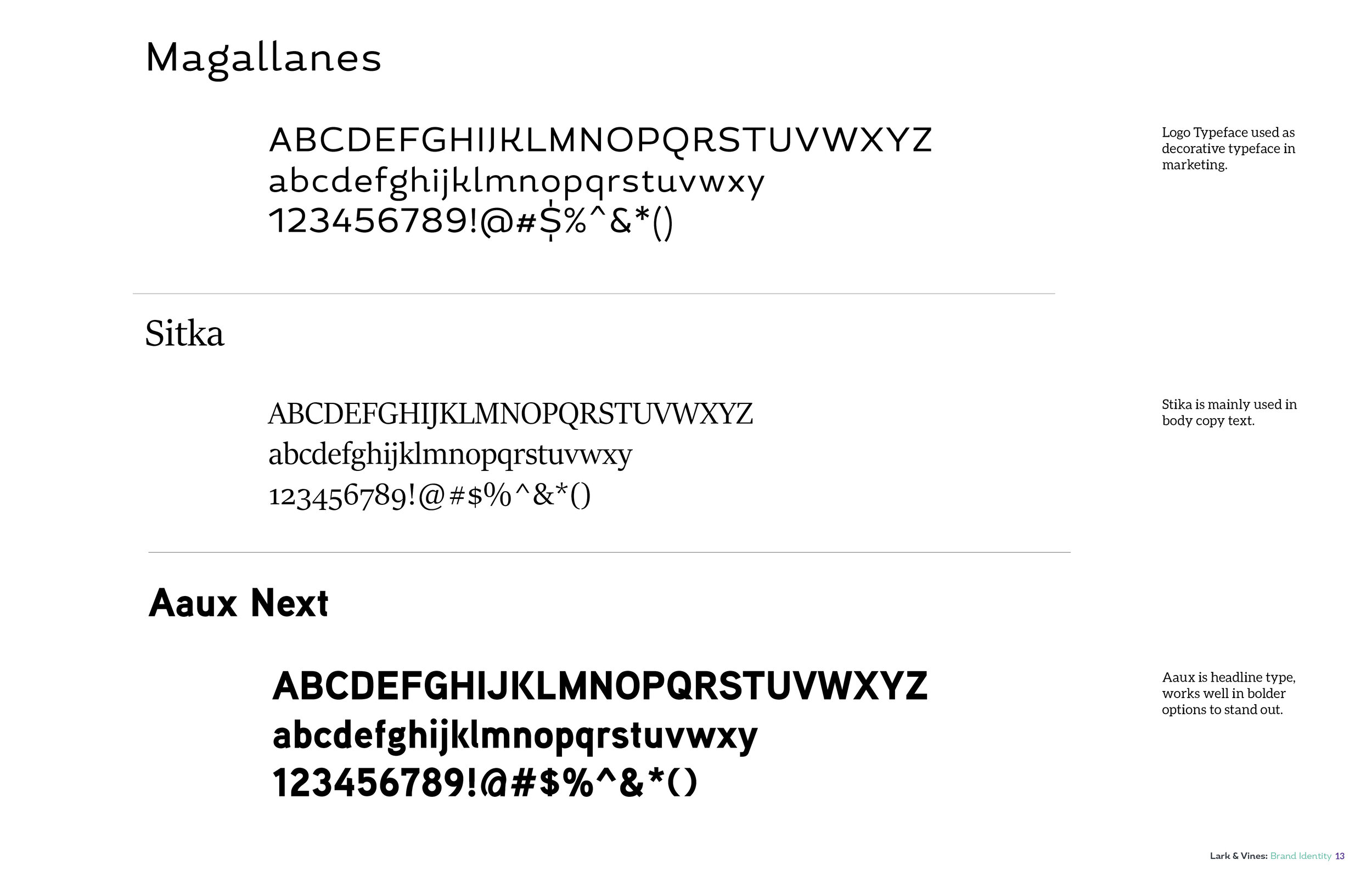
Brand Identity
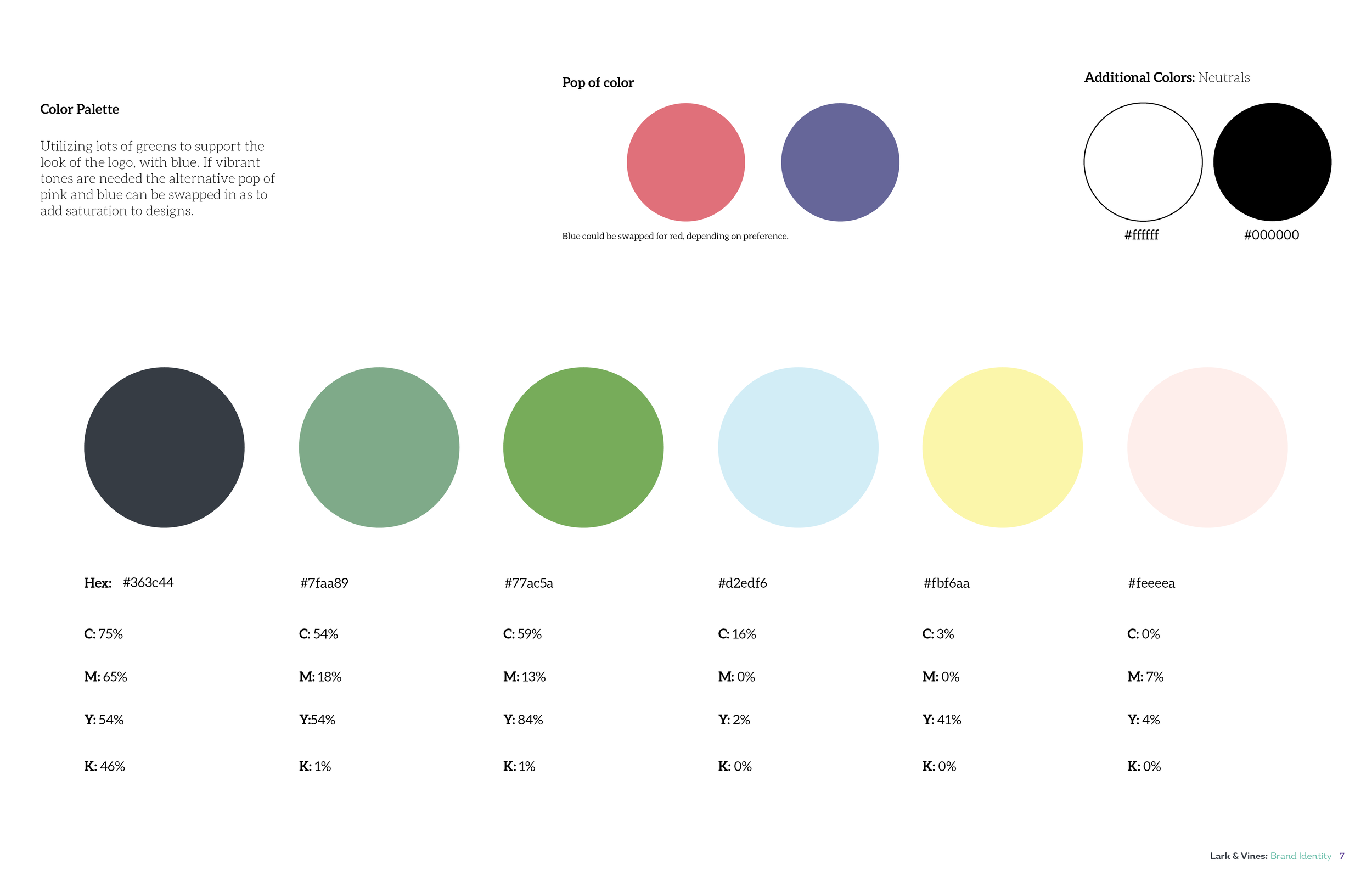
The brand identity for Lark & Vines is very earthy and spring like but not being too over the top. The various tones of greens really help give the brand a calm nature feeling. I spent a lot of time exploring MANY green tones, going back and forth between bluer greens, and more warmer greens ultimately having a balance of the two.
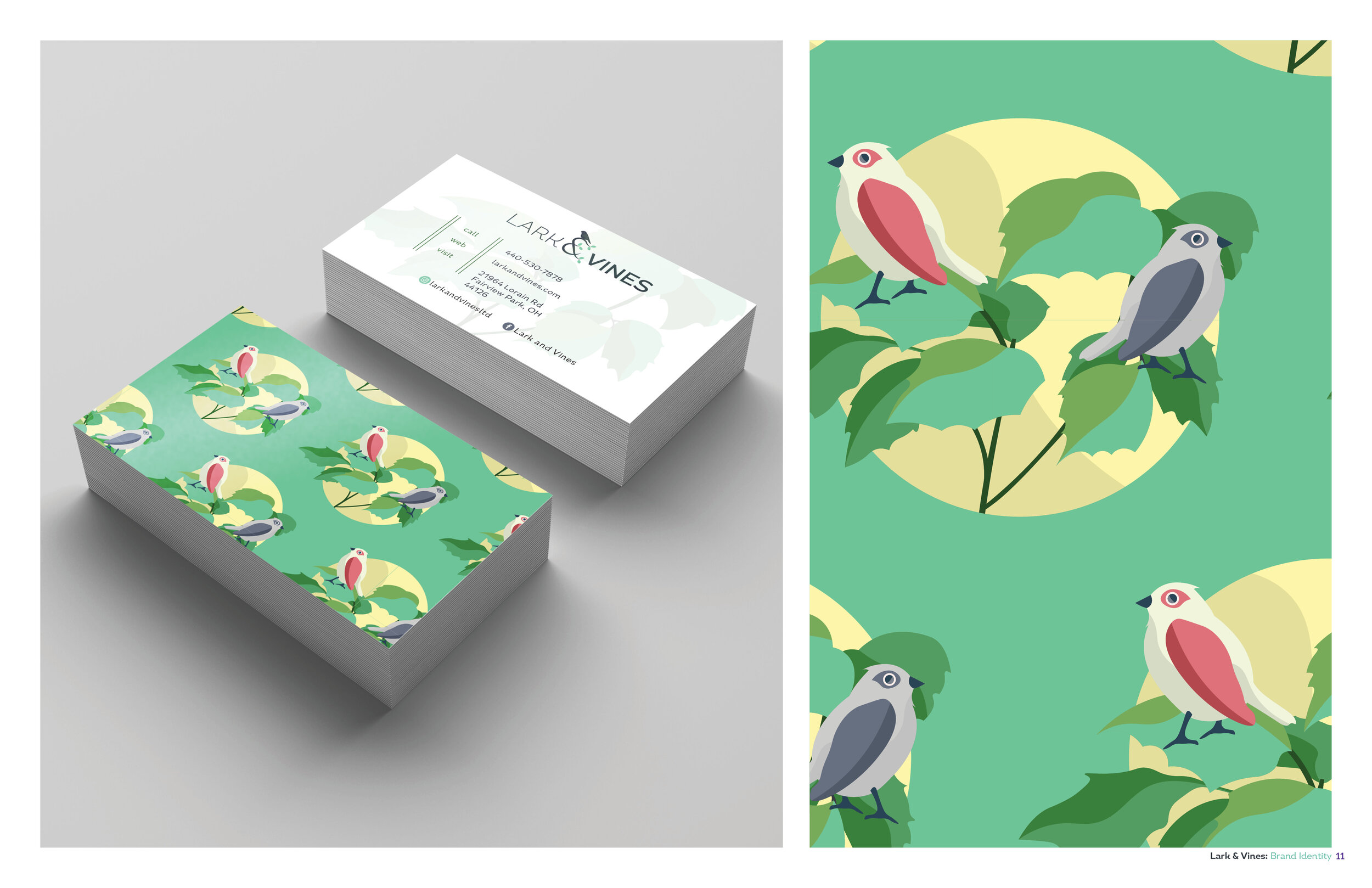

Business Card Design.

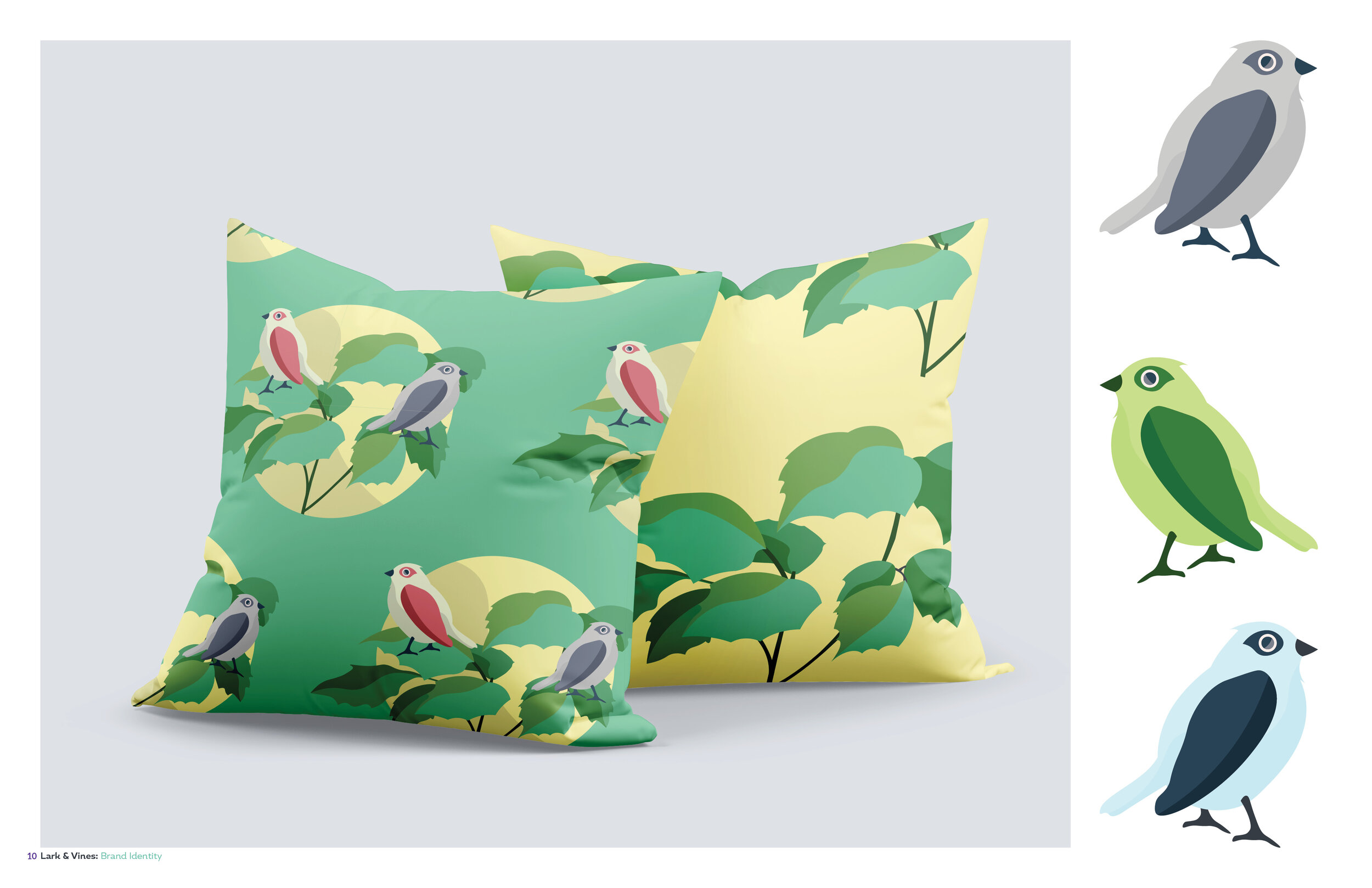
Pattern designs on pillows.

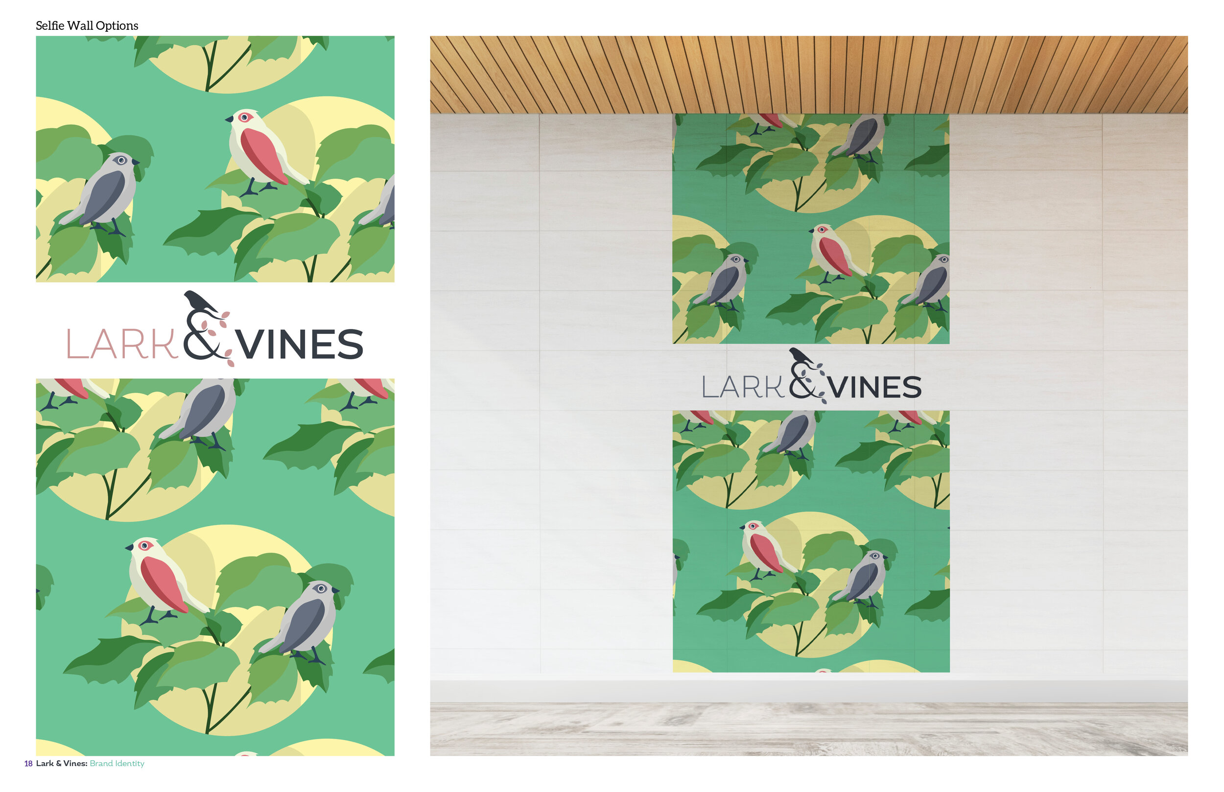
Selfie Wall Design.
I am SO happy to have the opportunity to turn Leslie’s vision of Lark & Vines to life. Being able to bring in personal touches to a brand from the creator is really what gives brands that extra special feeling.
Thanks so much for reading, and please check out Lark & Vines June 15th, support local business, and let me know if there is any way I can help you bring your design needs to life.
Cheers,
Derek

Discover Estate Sales: Brand Idenity

Hello! Happy New Year! I am so so so hopeful that 2021 will be better for us all. I have been trying to be busy, working on various projects. My goal for myself this year is to post here on my blog at least every Friday. That is one of my new year goals for myself and I am going to try and stick to it.
I wanted to share this project I have been working on and off on, and actually am really excited for it. Discover Estate Sales is a website that shares where estate sales may be, I believe by location. While the website itself is still under construction, I have been working on the logo and brand identity for it. Here are some of the logo concepts, to refinements, and then fleshing out the brand identity for it. My goal was to keep true to a vintage style, but add a modern twist to the estate sale vibe.
Logo 1st Drafts
These 6 options I sent over for consideration as a 1st round draft.


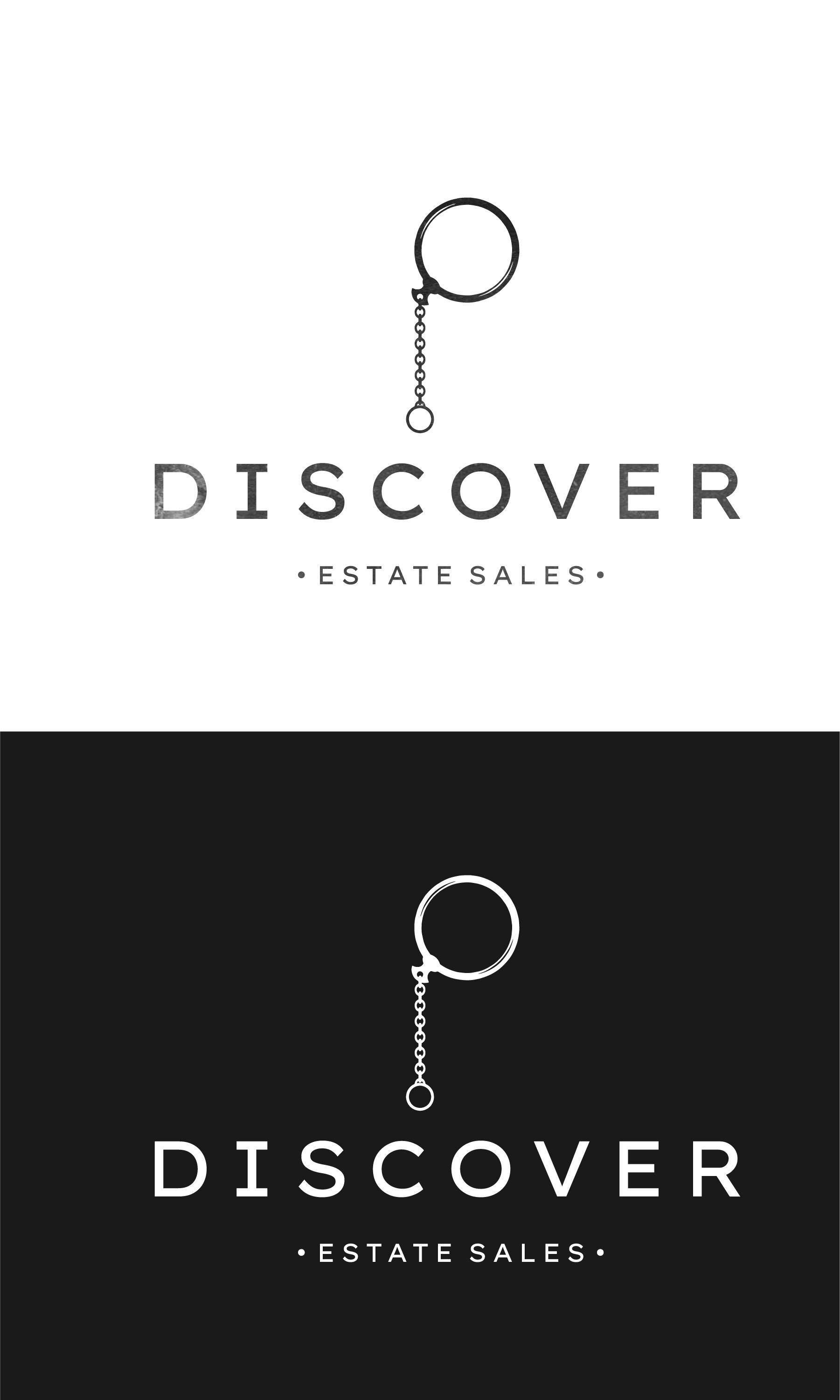
Once I received word that they had chosen one of my logos, I went into refining and fleshing out the brand identity. This included per the client: visuals, color, and slight changes to the original logo they had chosen. The following pages are the brand guidelines sent over to the client.


The brand identity is still potentially subject to change, but I have been having so much fun with it, I wanted to share the progress. When everything is complete, and the website is up, I will post another blog with all of that information so you all can check it out.
Happy Friday, and as I have committed to myself I will be posting a blog every Friday this year so until then!
As always, if you need graphic design work, or know someone who does I always appreciate any referral I receive. Take care!


Free Shipping on Print Shop till 2021!
I am running free shipping till 2021 on all orders from my print shop on derekdoesdesign.com/shop. I am adding some fun new designs as well, so check them out. Some prints have framed and unframed options, so gifting them with frames is a nice full gift for the holidays. All packages come securely wrapped, whether it is a print, or framed piece. Shipping is about 7 days, so plenty of time still for the holidays. Some of the new prints are below.

New Print. Framed and non framed options available.
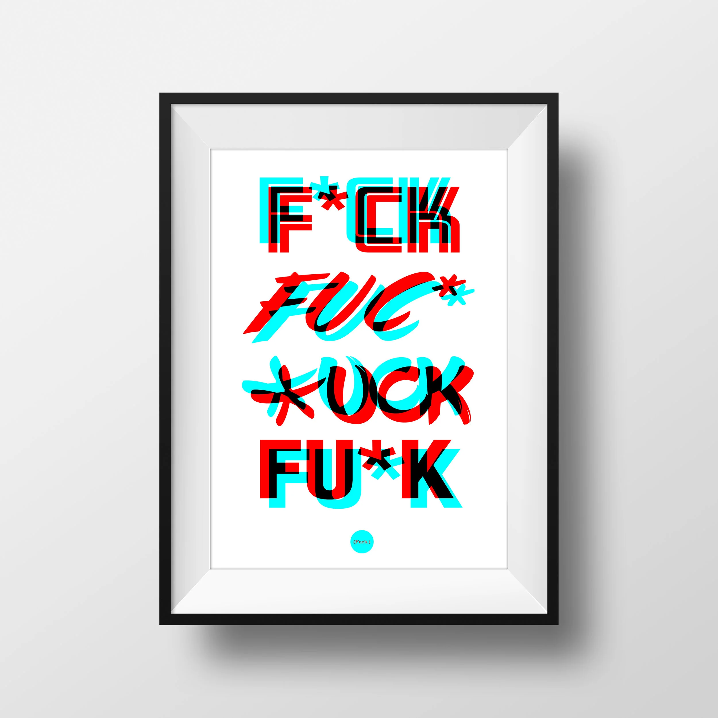
F*UCK Typography Print. Perfect holiday cheer. ;)

Industrial Bridge Print- Orange

Cleveland Circle Map Print- Red. Will come in multiple colors.
i will be adding a few more pieces, which I will post about as I launch them. I hope you all have a great and safe holiday! As always, if you need graphic design work completed please reach out to me and let me know! I look forward to working with you if you do!
Cheers!
-Derek


THE BLACK BRAND Water Bottle Packaging Design
Happy Friday my friends! I wanted to share a project I completed a while ago, but am now able to share it. The Black Brand focuses on sleek merchandise and apparel in their shops online. I helped them with the packaging design for their water bottle.

Final Packaging Design

Flat design of box.
Check out The Black Brand’s website here
The link to this specific water bottle that comes in this packaging is here:
https://www.theblkbrand.com/product-page/stainless-steel-vacuum-seal-cup
As always, I hope you all are safe and well, taking time for yourself each day. If you need graphic design work, feel free to reach out to me! I would love to help.
Cornerstone Design & Renovation Branding
I recently completed business card and branding design for Cornerstone Design & Renovation, located in Cleveland Ohio. Cornerstone Design & Renovation is a home consulting business that helps its clients plan for a home renovation. Here, I am talking about the design process I went through to help out their business.
Happy Wednesday! I just completed a business card design, and branding project for Cornerstone Design & Renovation. One of my dear friends, Matt is the owner and starting his own home renovation consulting business. I was happy to help him with the design of his identity.

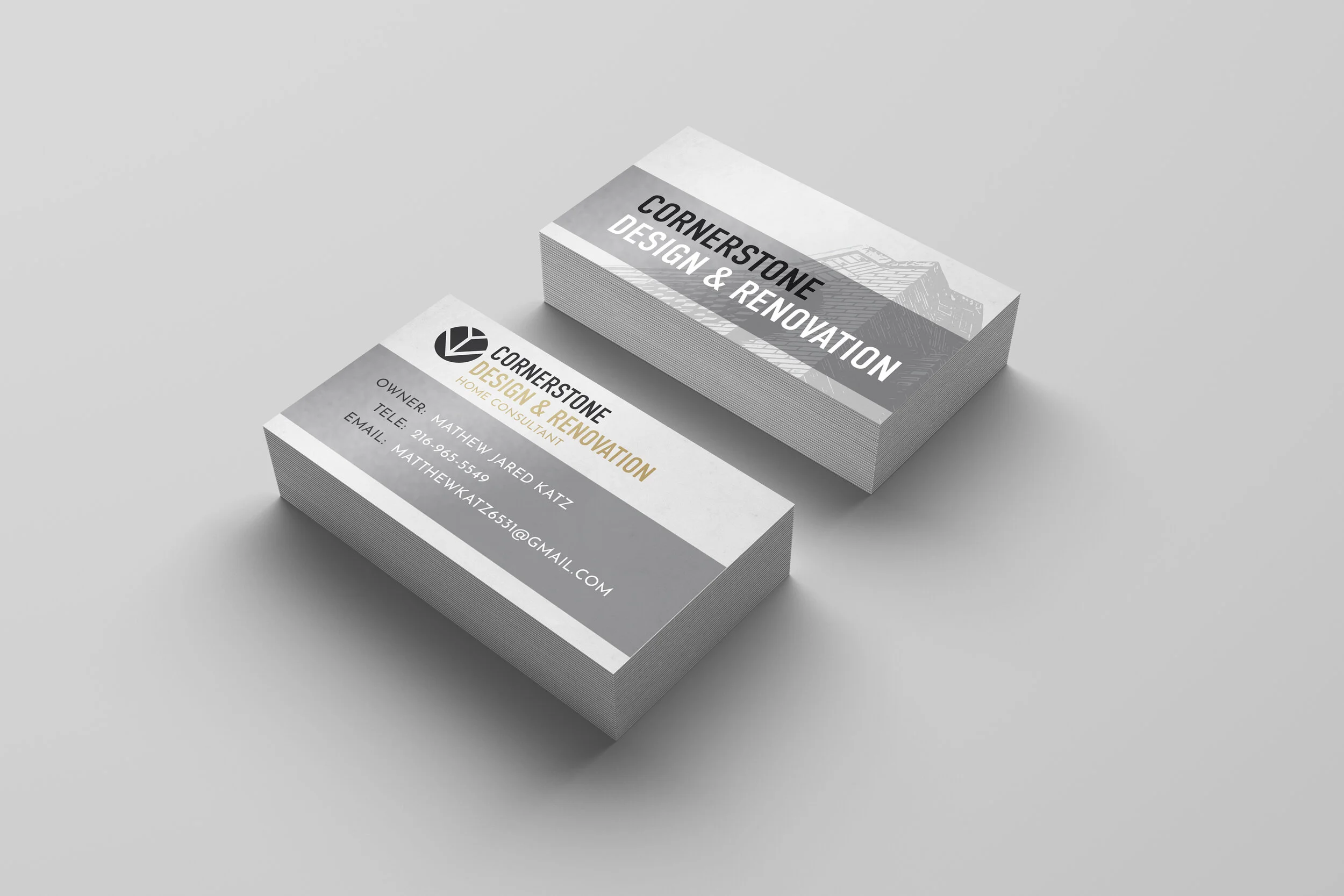
Final Design
Matt was able to send me some inspiration to pull from, a beautiful stained glass window and some colors on a mailbox. These colors laid the foundation for some of the concepts.
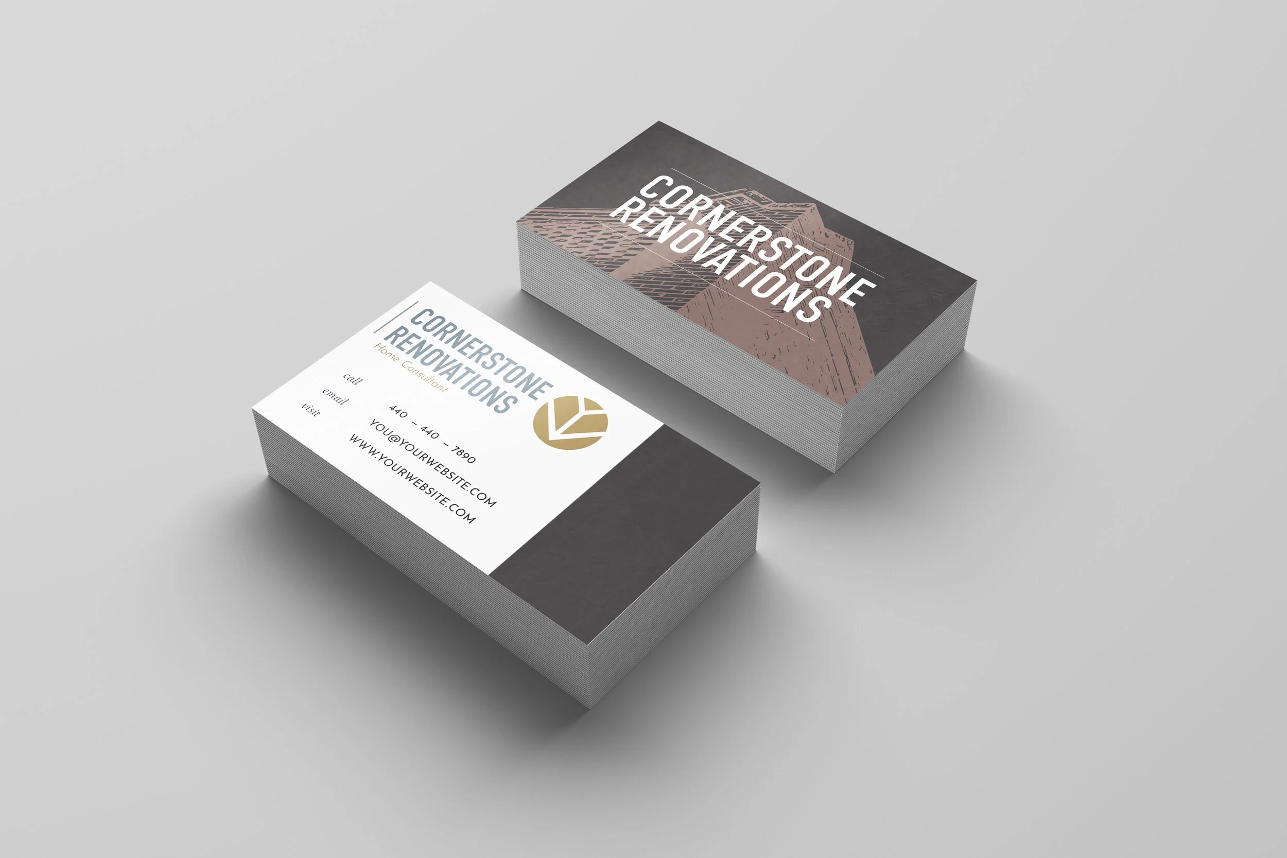
Draft Prototypes
Options are nice, right? When I sent over the prototypes, I wanted to include a variety of options for Matt to choose from. I played with stone textures in the backgrounds, faint but they add a bit of depth and dimension to the design. I also wanted to apply a real world look for how they would look produced, rather than flat graphics so I utilized a good mock up for that.

Early visuals and branding.


Logo

Logo Design
It is important to develop a brand, and a brand can develop over time. I wanted to create a simple logo for Cornerstone Design & Renovation that is clean, clear and easily changeable in typography and color.
Branding

This is some early branding concepts I sent over, and visual research. Ultimately we went with the more graphical corner shown below, which works really well in the design.

If you are in the Cleveland area and are thinking of doing some home renovations please reach out to Cornerstone Design & Renovations for help.
Cornerstone Design & Renovation
216-965-5549
MatthewKatz6531@gmail.com
Hope you all are having a fantastic week!
-Derek

