

Lark & Vines: Brand Identity
Hello everyone! It has been a minute since I have posted a blog update! I am so excited for this one as I have been working on if for a while now. Now that it is finished I am excited to share! Lark & Vines is a home goods store opening up June 15th, in Fairview Park OH. One of my old co-workers and friends Leslie Choma is the owner of the business, and this is her vision I was so lucky to be able to bring to life.
Leslie came to me with a fantastic concept, and business model that really resonated with me. I think one reason why the outcome is fantastic is because of that solid idea, and reason behind the brand. I truly had a lot of fun working on this project and I hope you all have fun checking it out. I will be posting another blog post after the store opens with updates, and an interview with Leslie on her store, and brand. If you live in the Cleveland area and are able to go check out Lark & Vines June 15th, please do!
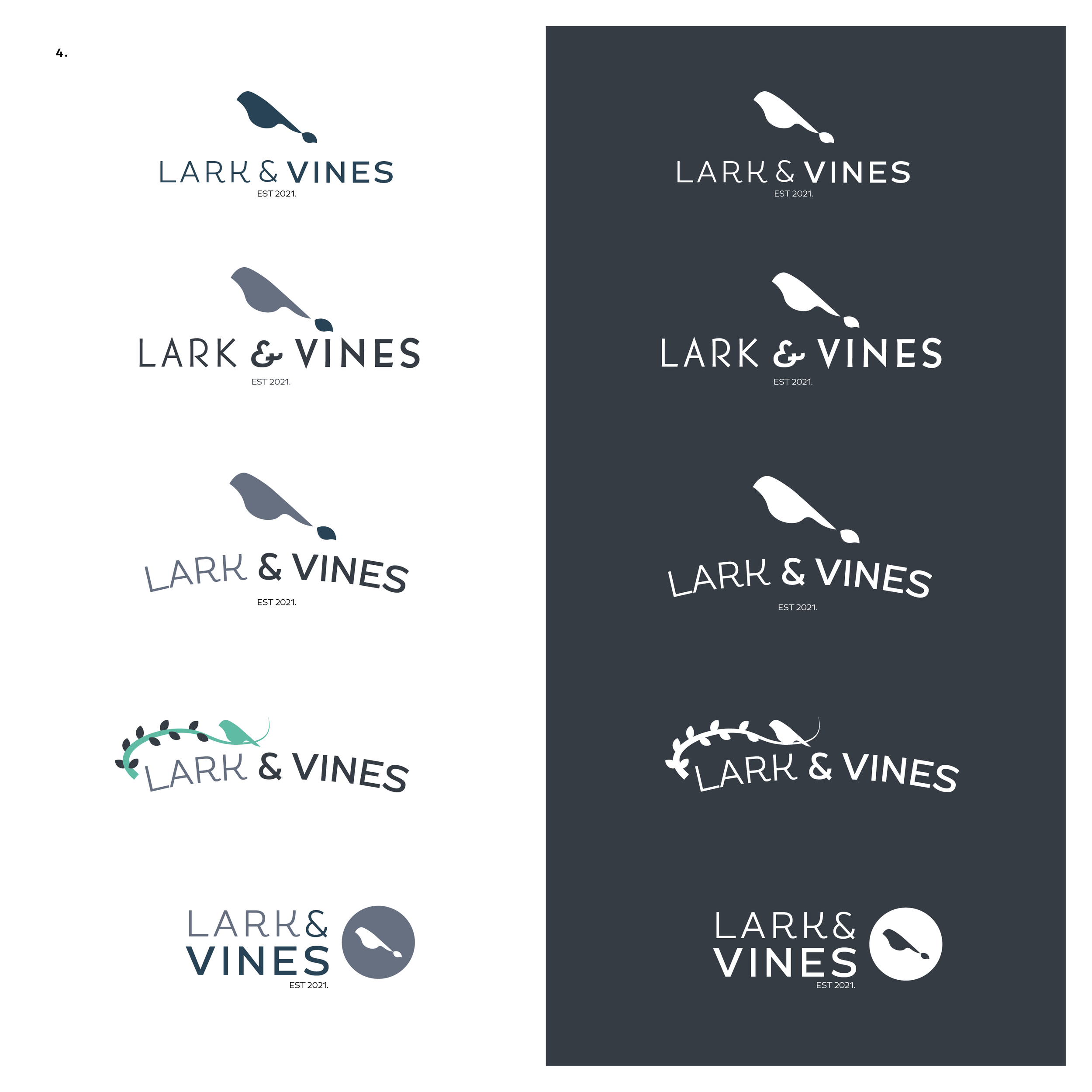
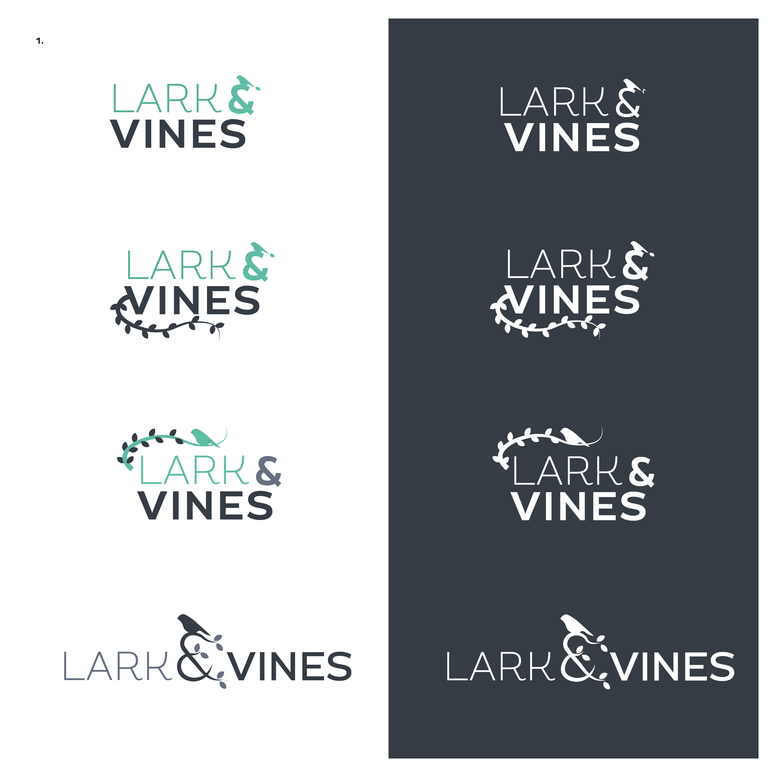
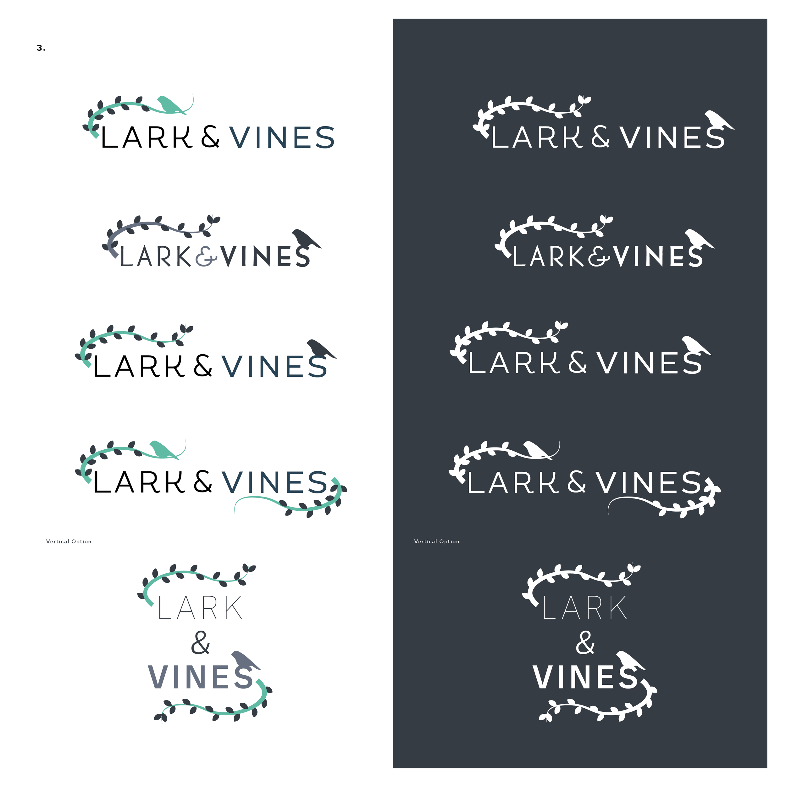
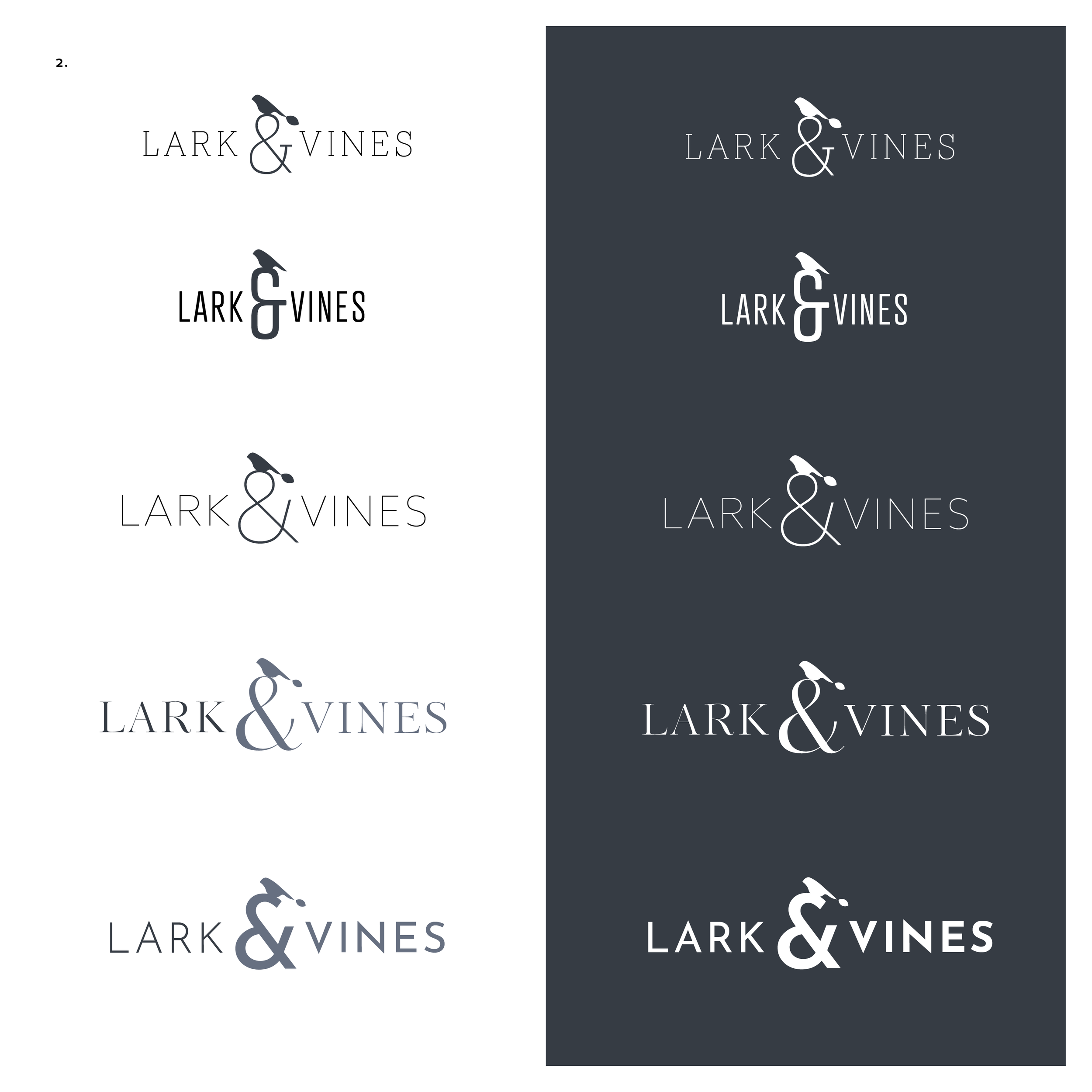
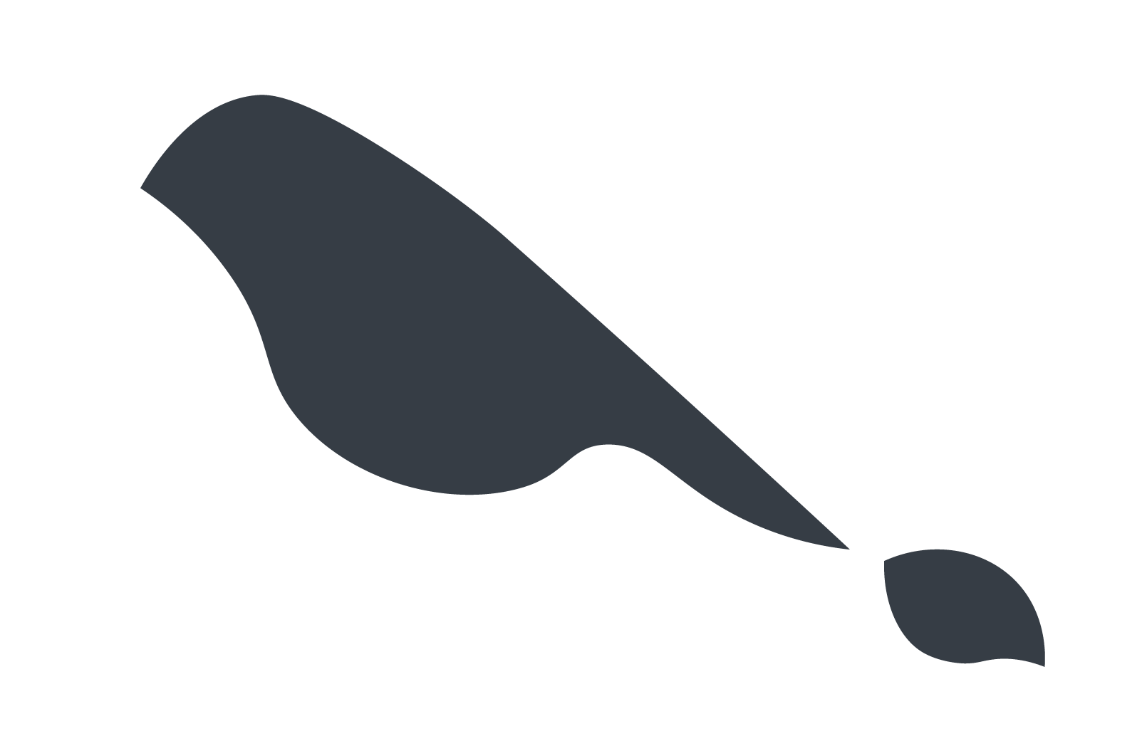
Logo Variations
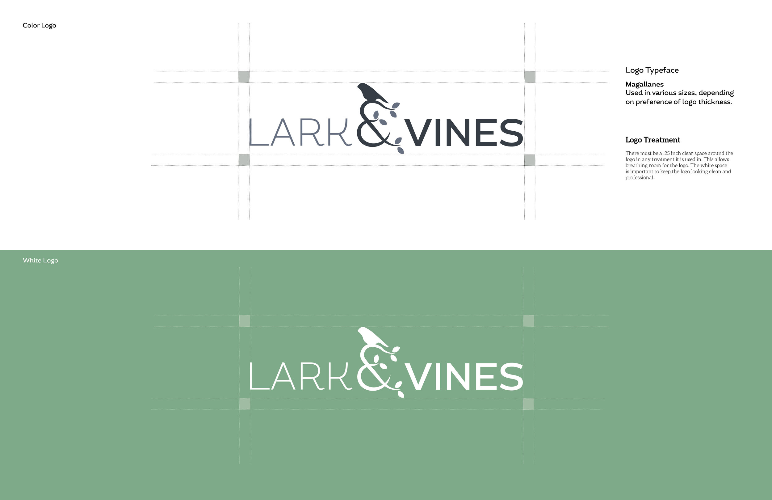
The final logo for Lark & Vines is pictured above, but designing the logo was quite fun. I think the final logo has a nice balance of organic shapes, and visuals, that showcases the vibe of the brand well.
Usually when I share drafts to a client it is not this many, but I had a lot of fun playing around with the logo and wanted her to see the variety and make a choice for what was best for her business. These were refined from the 1st drafts sent over, and while I saw many that could be the final logo design, the final one speaks to the brand perfectly.
Icons

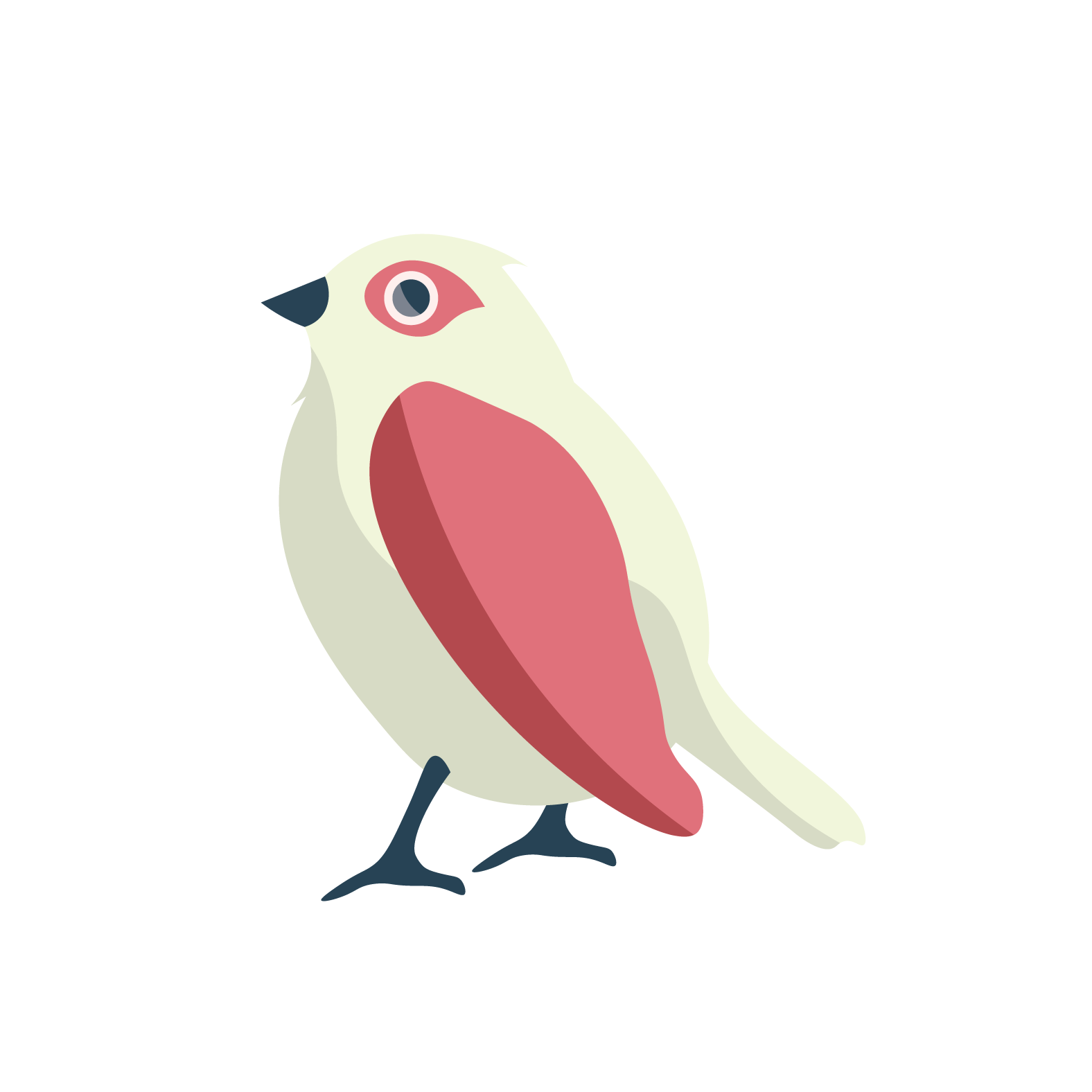
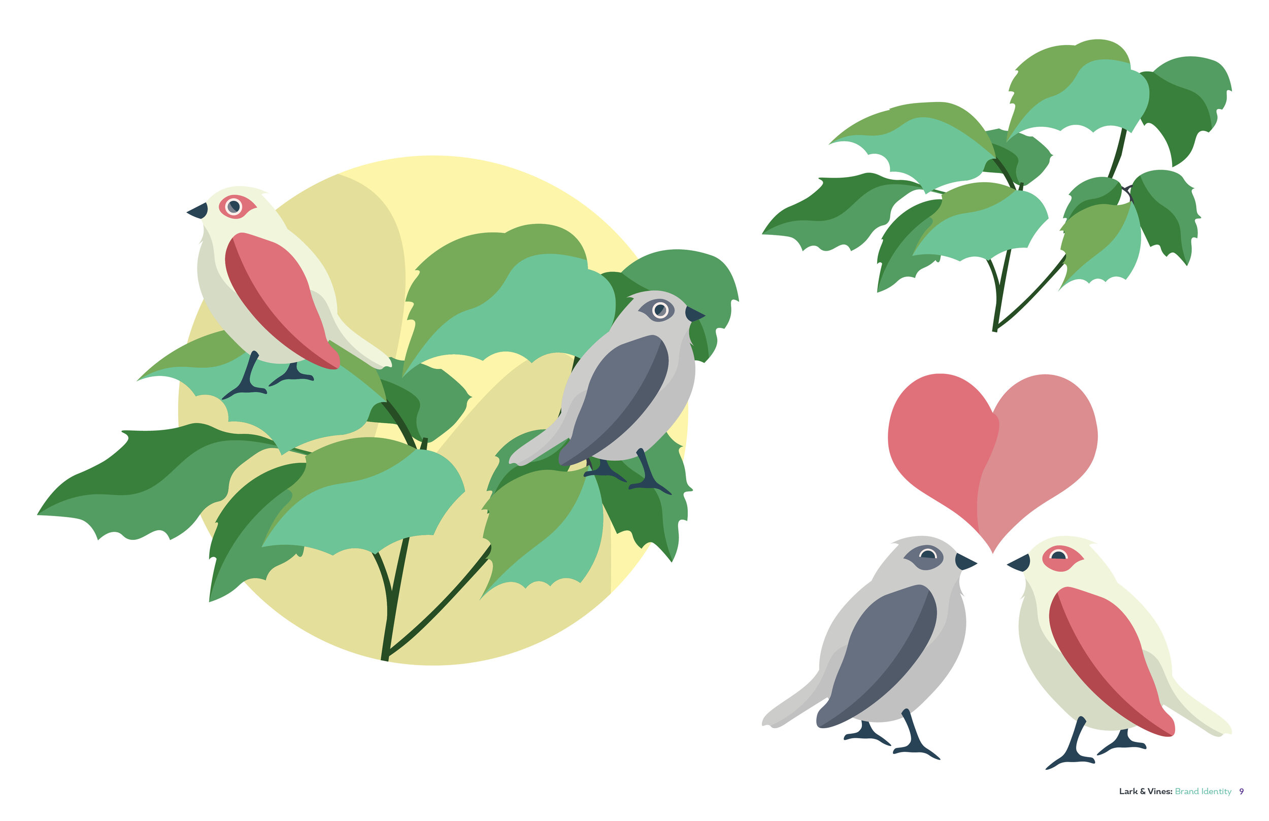
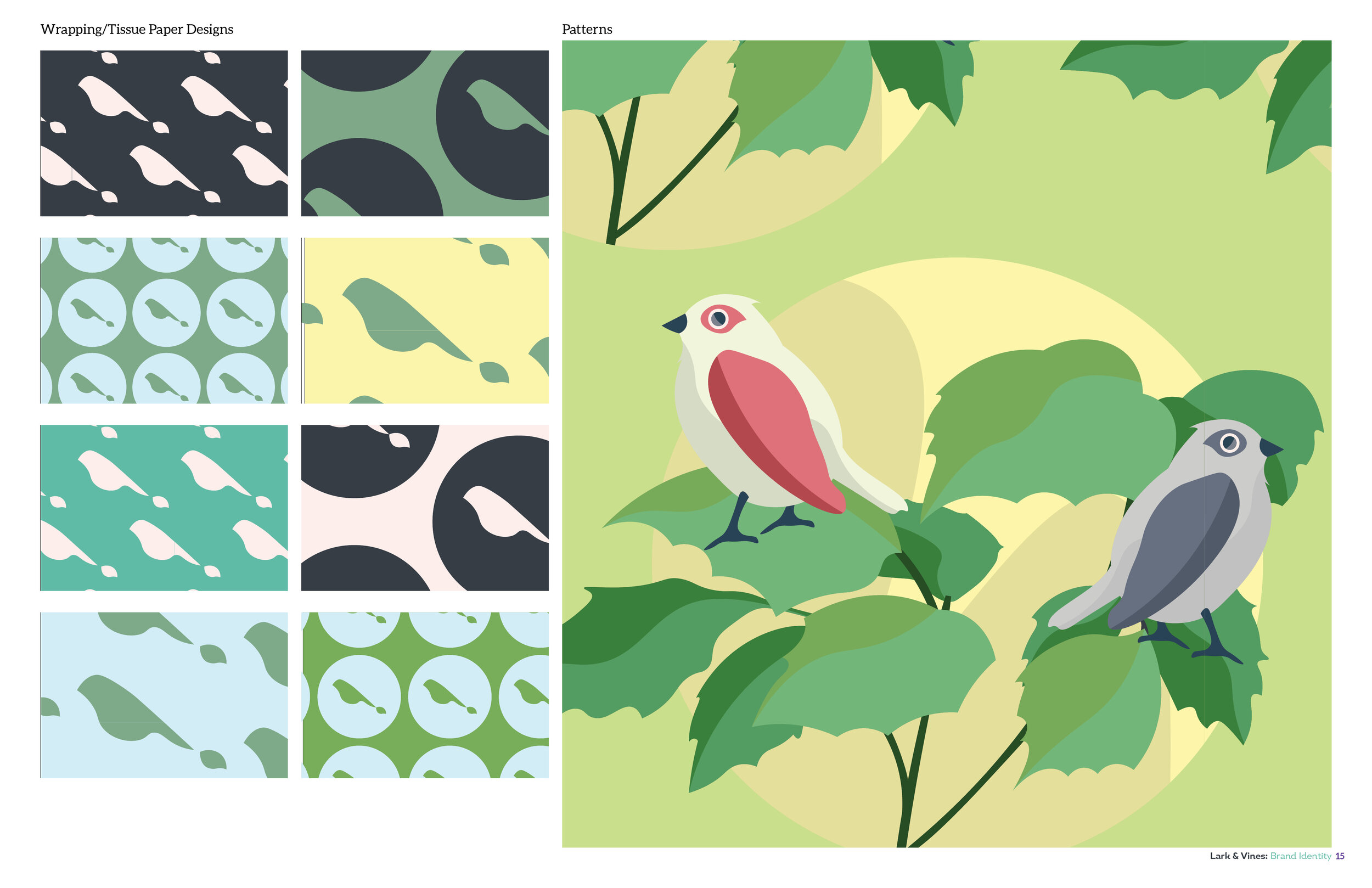
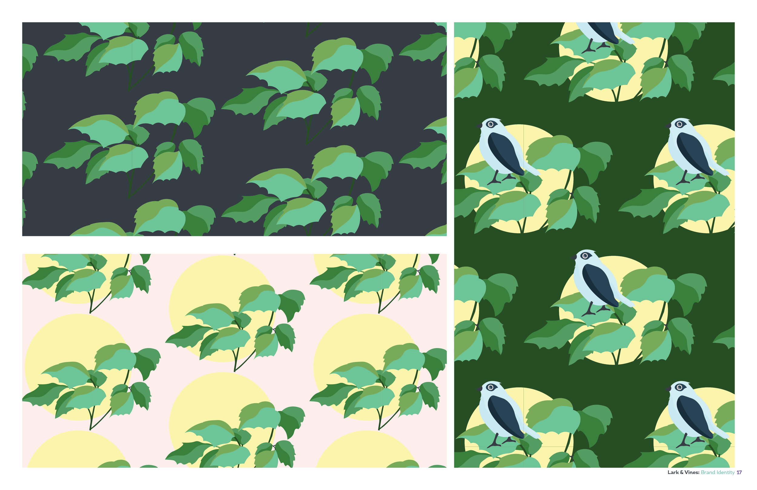
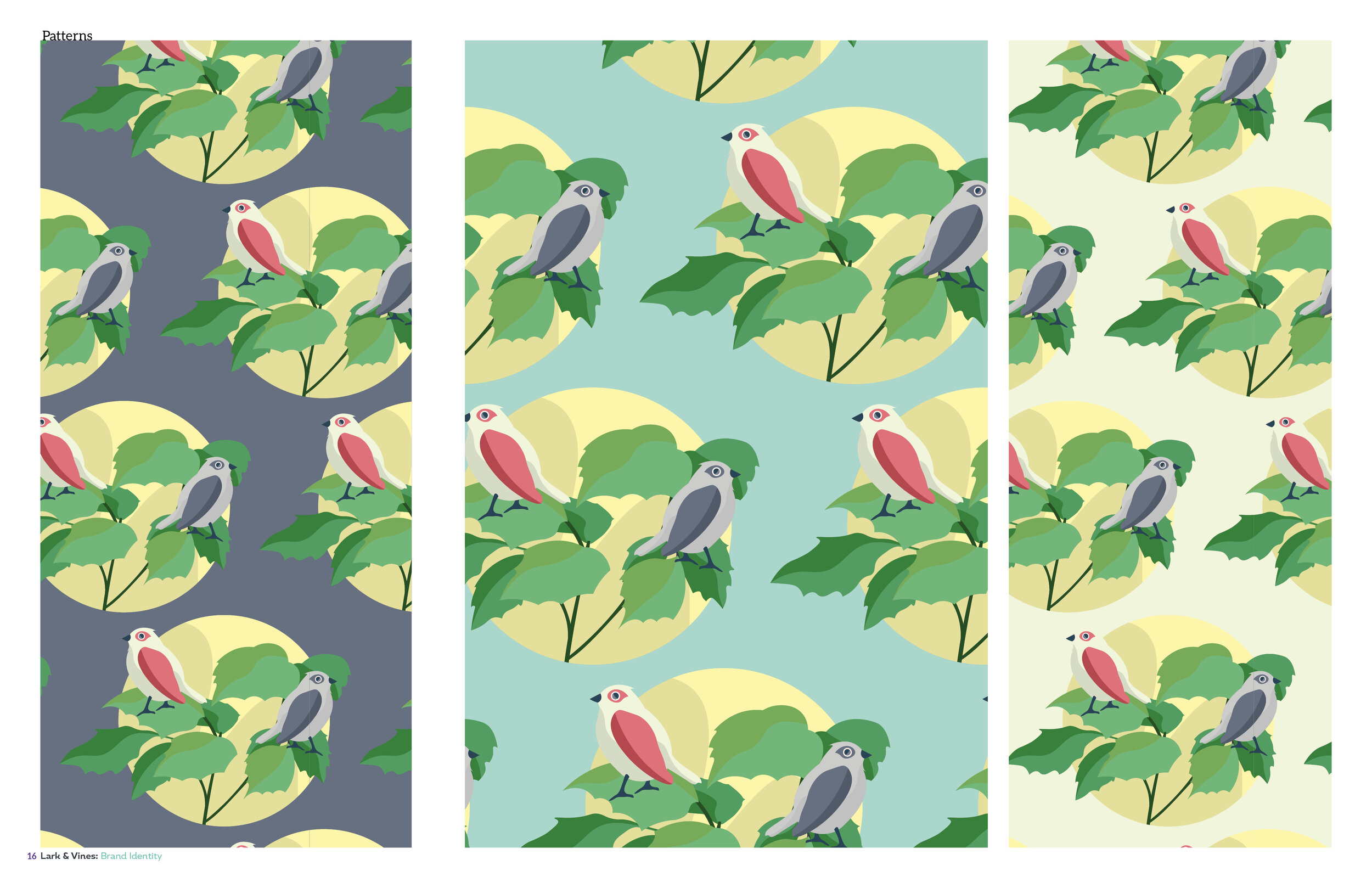
Illustration
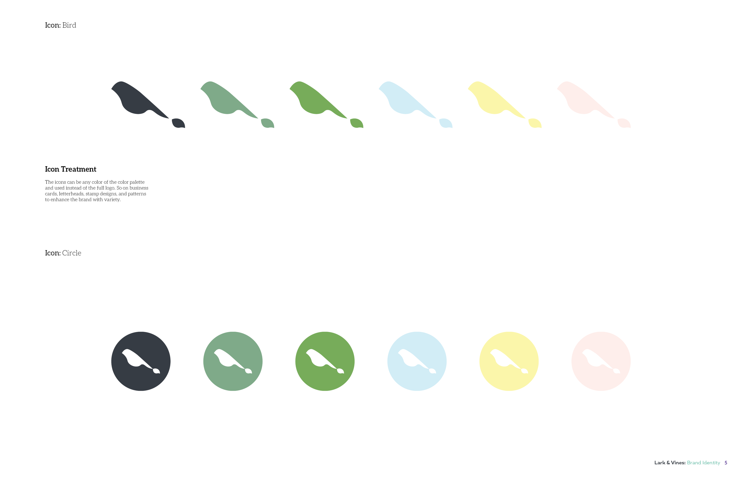
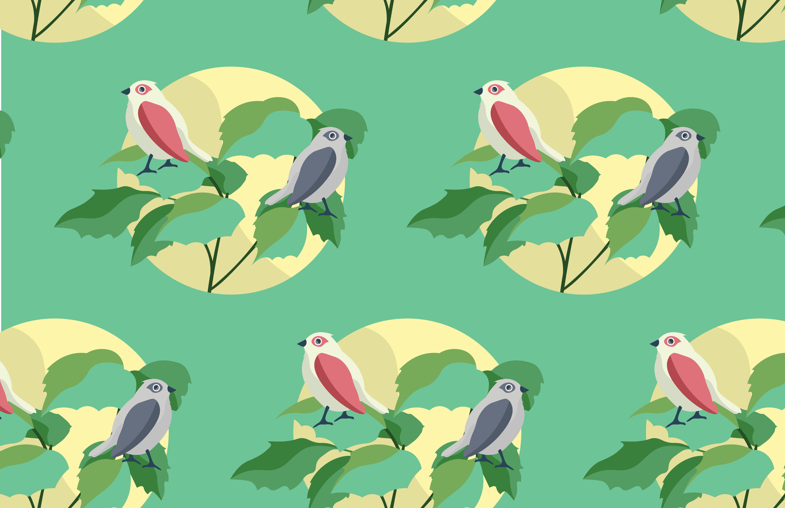
I had a lot of fun illustrating the larks, and their vines. The vines were taking from photos Leslie provided of vines her mother and grandmother gave her. This was a nice touch to tie in a personal meaning to a design, that also plays a part in the meaning behind the brand as well.

This is the main graphic is utilized in the patterns designed for the business.

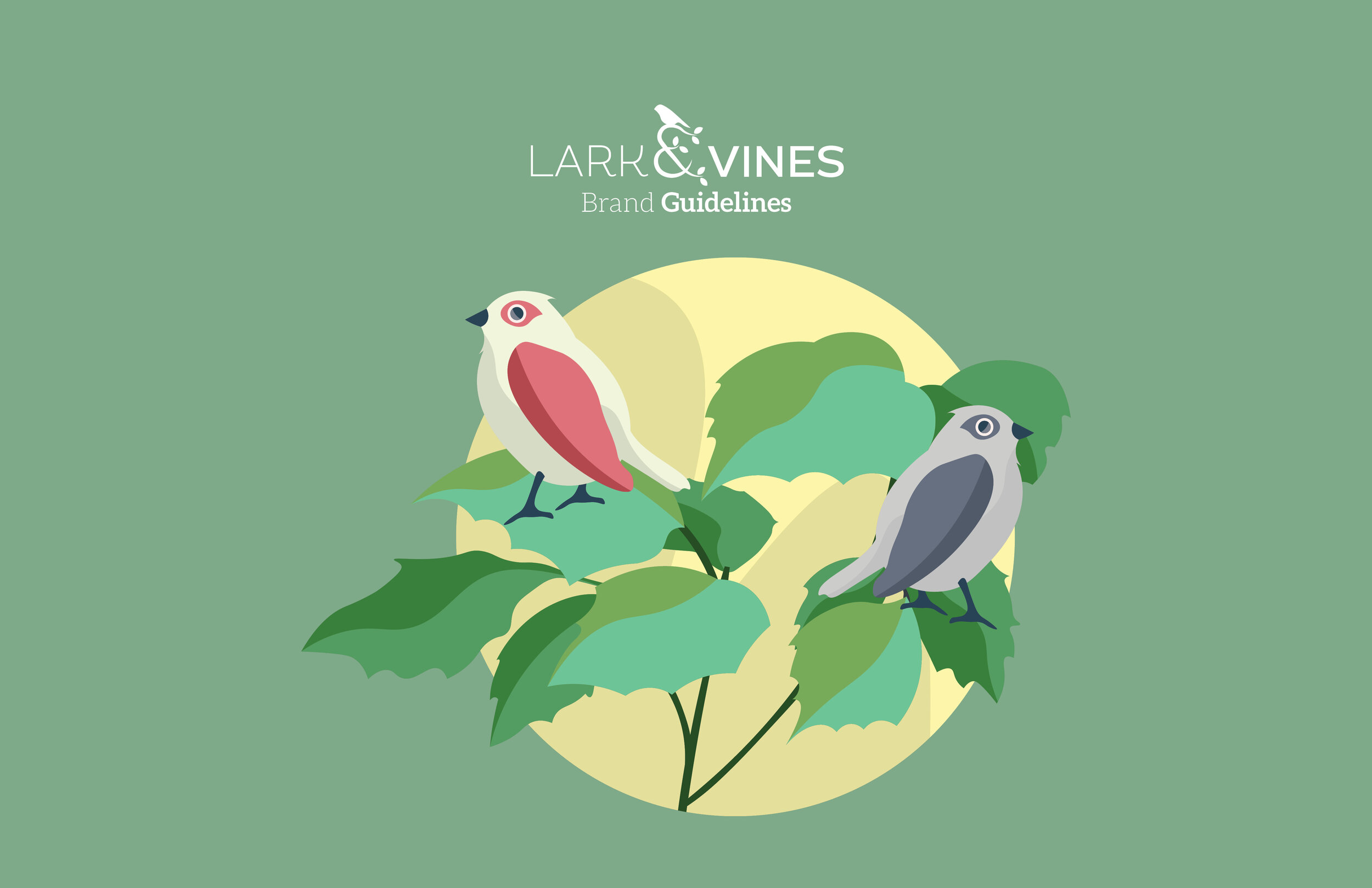
Love Birds


Brand Identity
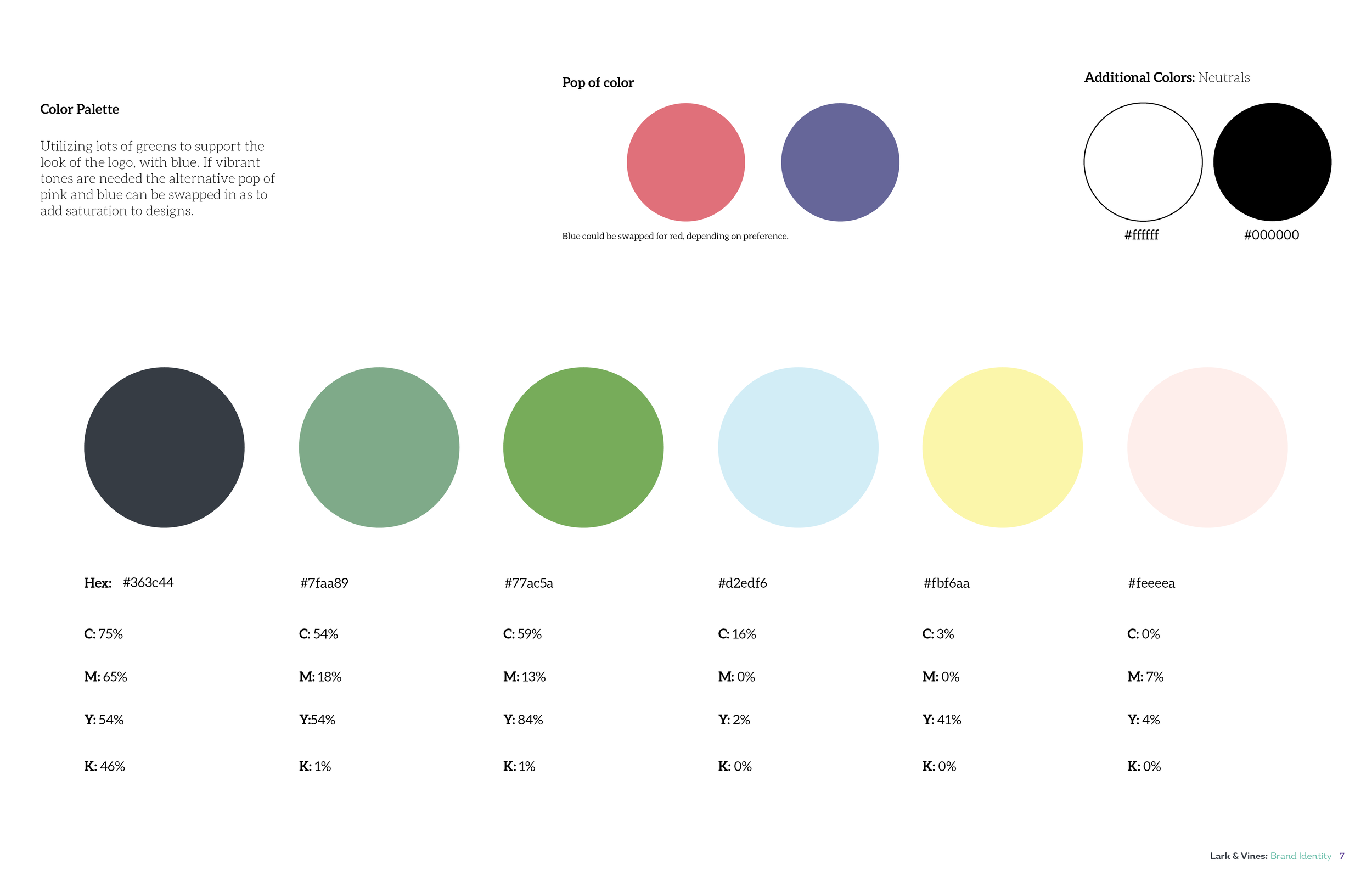
The brand identity for Lark & Vines is very earthy and spring like but not being too over the top. The various tones of greens really help give the brand a calm nature feeling. I spent a lot of time exploring MANY green tones, going back and forth between bluer greens, and more warmer greens ultimately having a balance of the two.
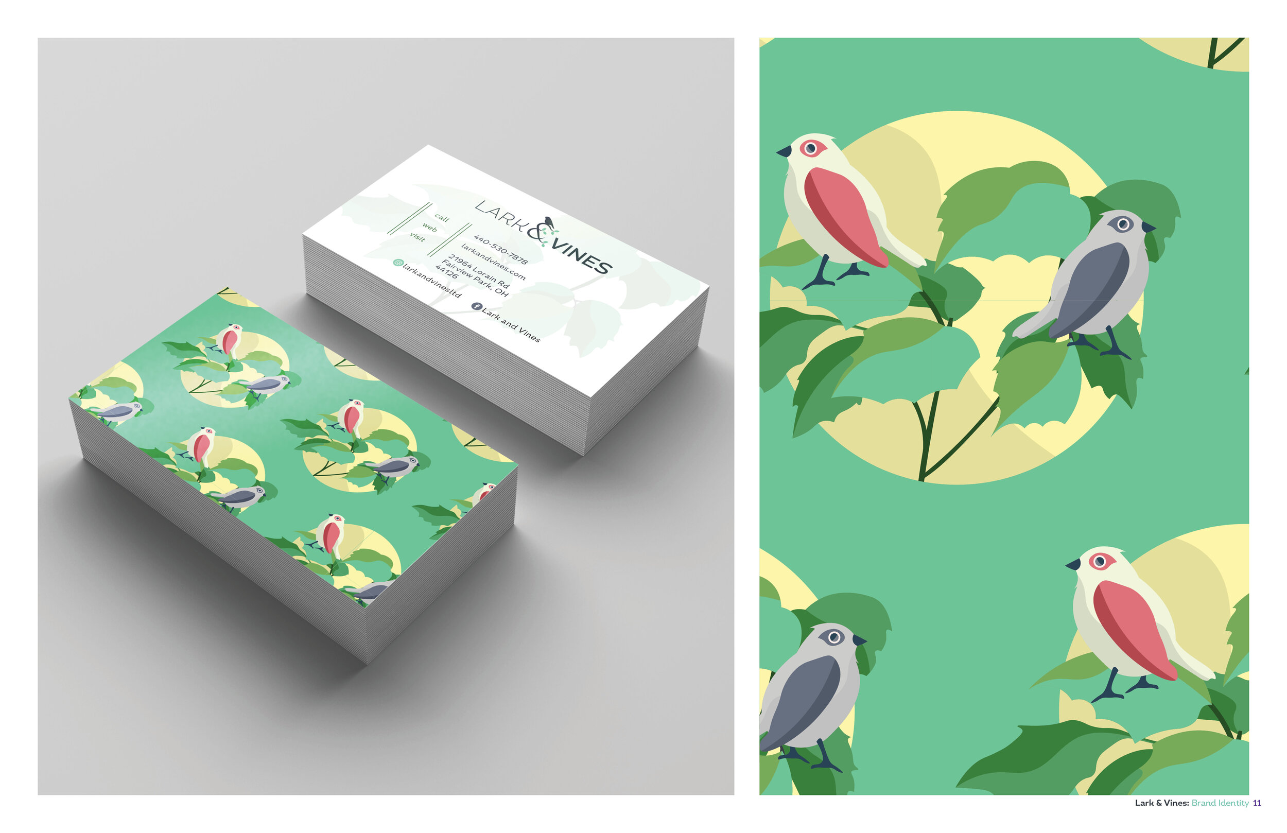

Business Card Design.

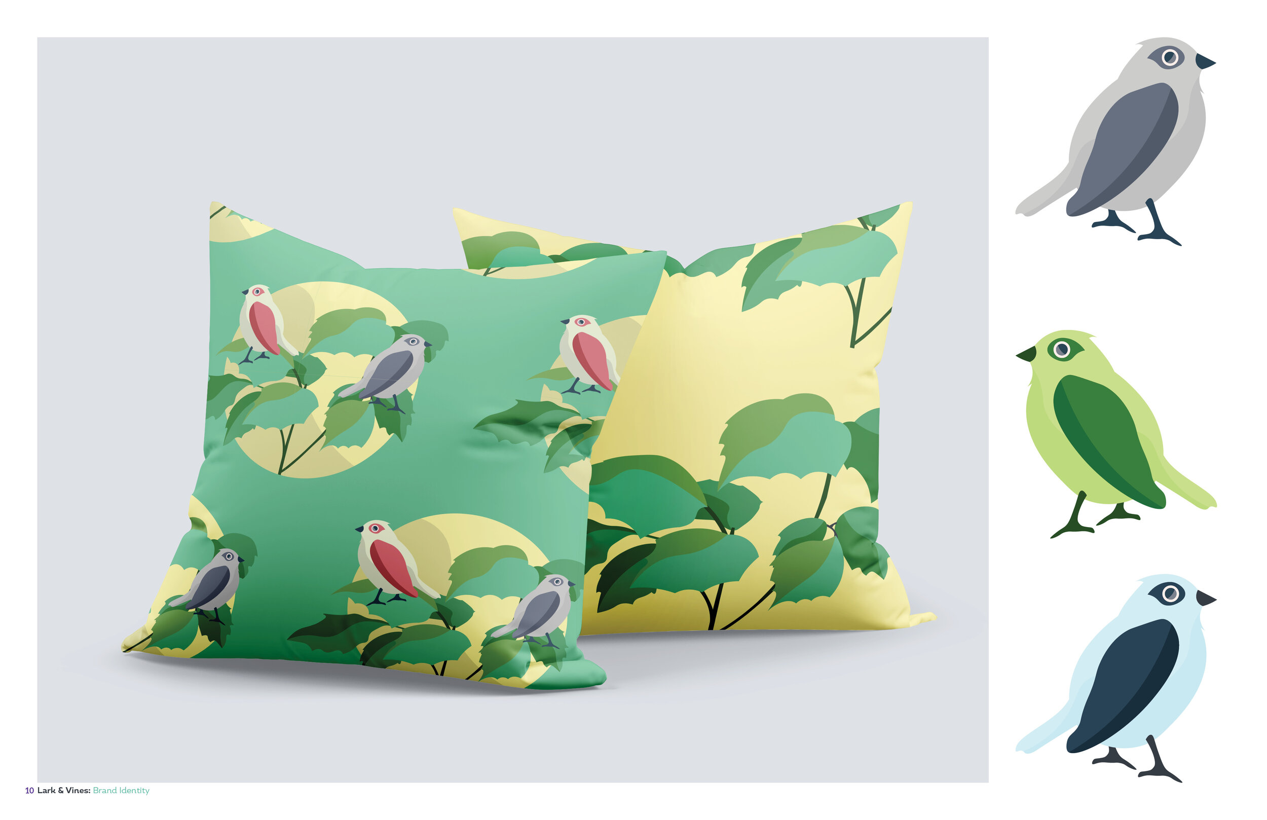
Pattern designs on pillows.

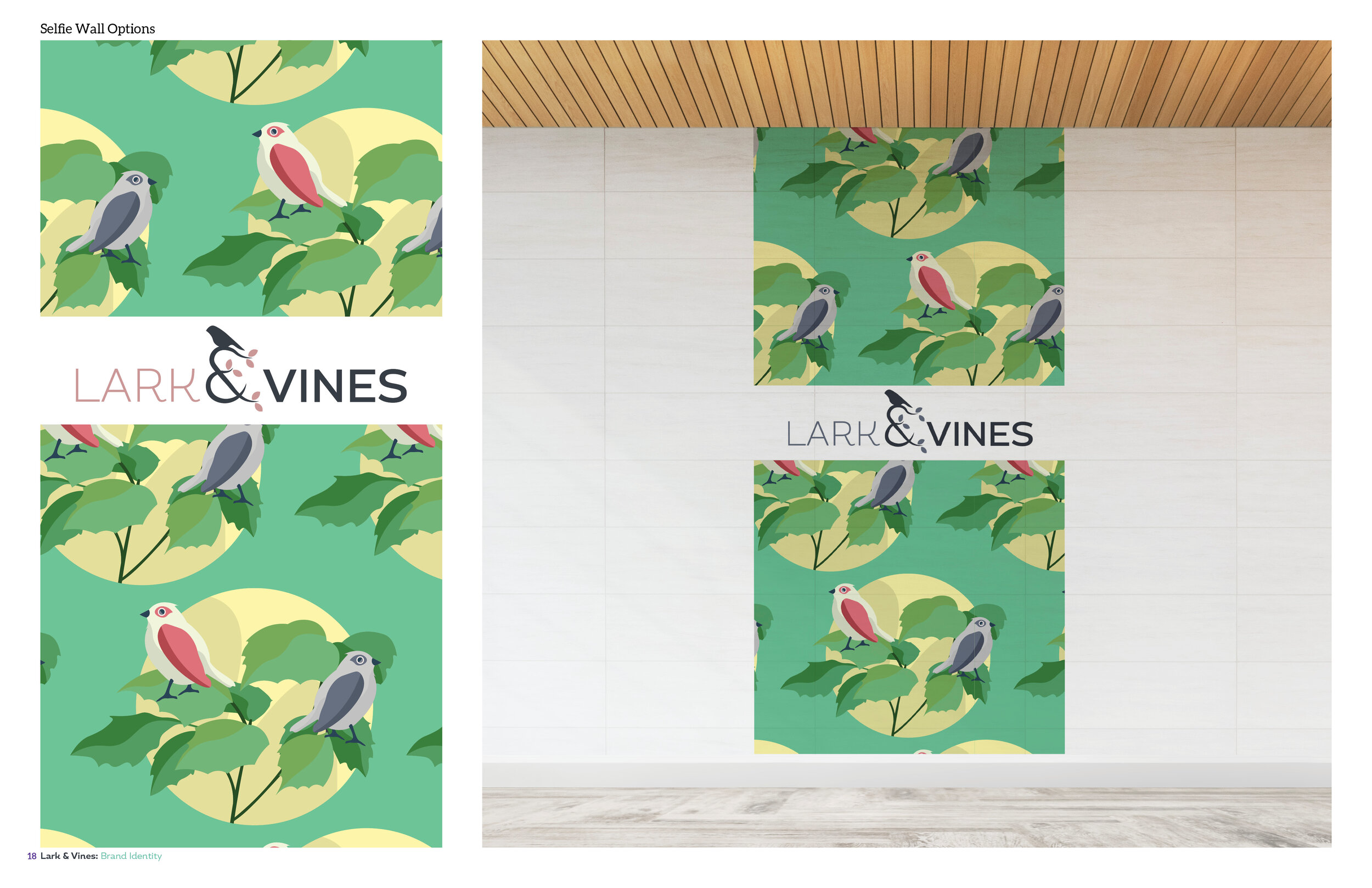
Selfie Wall Design.
I am SO happy to have the opportunity to turn Leslie’s vision of Lark & Vines to life. Being able to bring in personal touches to a brand from the creator is really what gives brands that extra special feeling.
Thanks so much for reading, and please check out Lark & Vines June 15th, support local business, and let me know if there is any way I can help you bring your design needs to life.
Cheers,
Derek

CLVD HAIR STUDIO LOGO
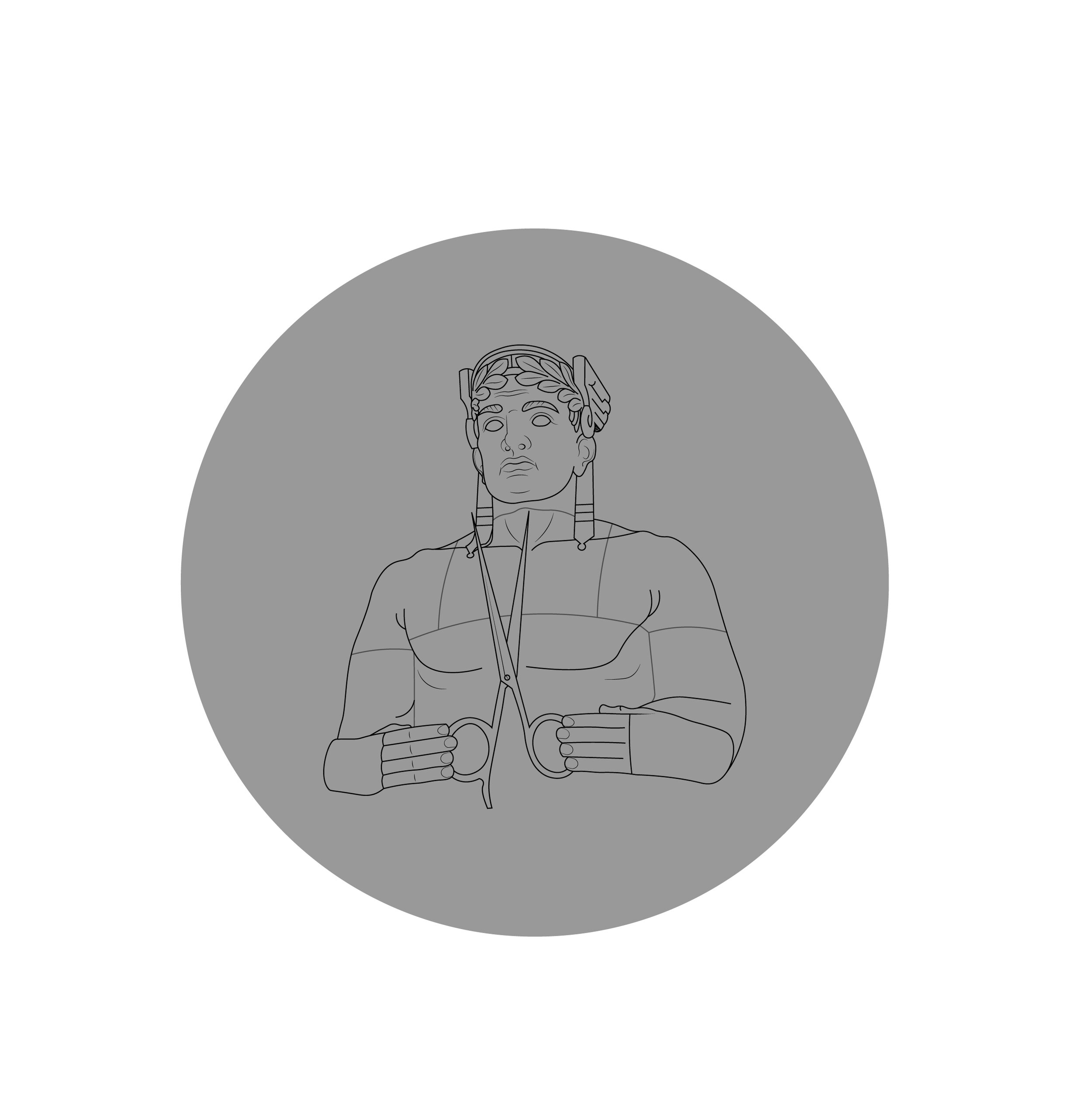
Hello my friends! I am lucky and thankful to have such a nice referral base which brought me to work with Katie at CLVD HAIR STUDIO, located in Avon Ohio. If you all need your hair done and you are in the Cleveland area, please go visit her! Her Instagram is @hairbykatiekim so check her out Cleveland! Overall I really loved doing this project, and I love the Cleveland Guardian statues so it was a win for me. Katie had a clear idea of what she wanted, so it was fun to take her clear idea and make it a reality in my own way.
I wanted the guardian illustration to work in the logo, and on his own as well. I created various icons Katie could utilize on marketing materials, business cards or social media.

Icons


Vertical Logo Version


Illustration Details
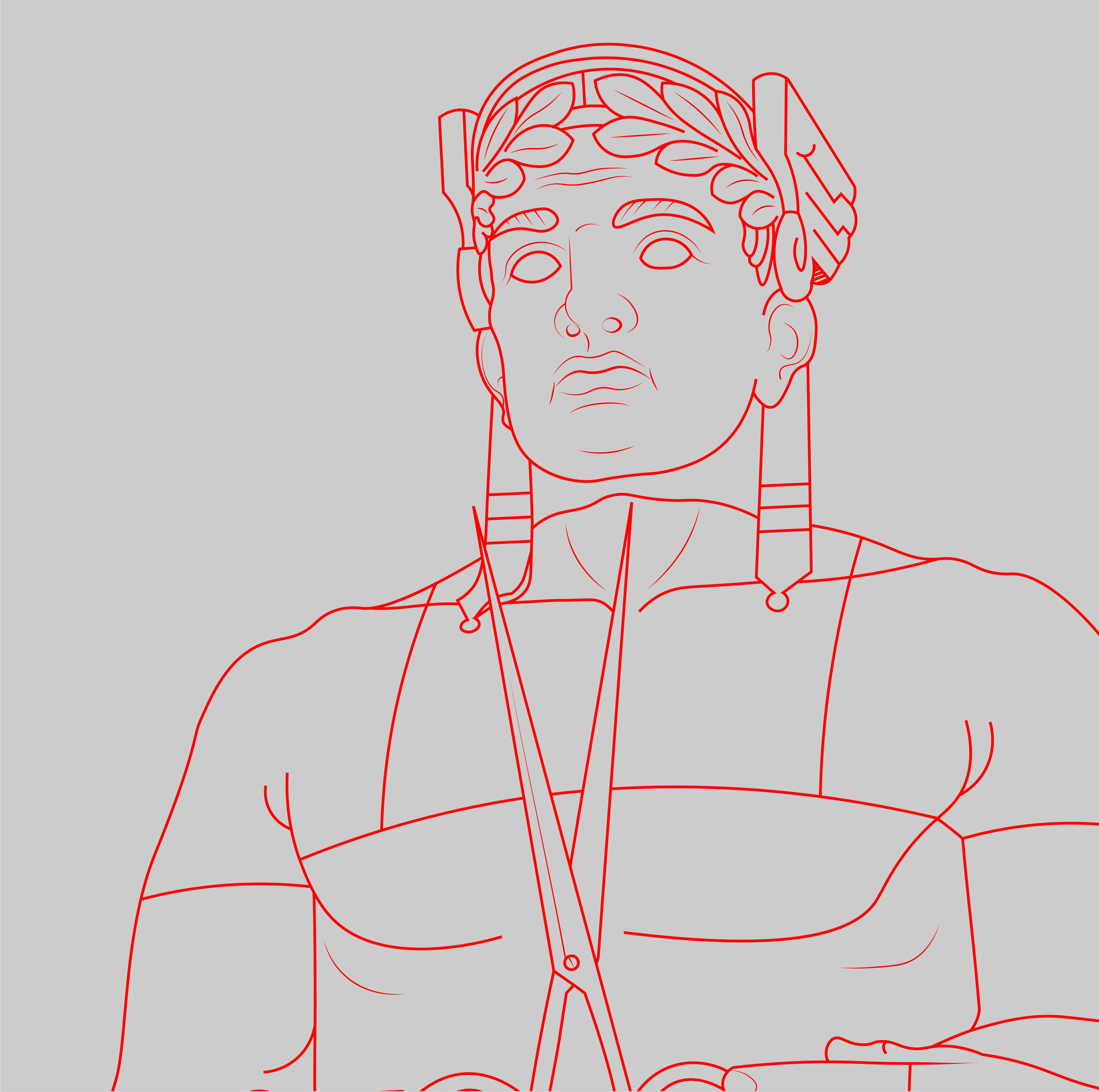
Illustration details.
© 2020 Derek Prince Wilson of Derekdoesdesign.

HXDCRAFT Logo Design
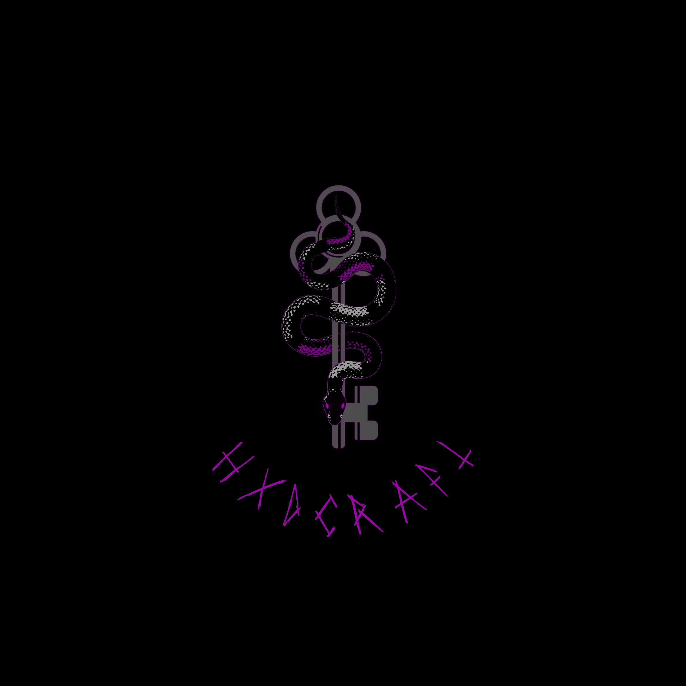

Close up details.
I was lucky enough to work with such an awesome client Christa, at @HXDCRAFT. Christa was a designers dream, who gave feedback and had creative ideas of her own, that really fleshed out the logo to be what it became. I was given to main goals for this logo:
A serpent.
A 3 hole key.
The serpent to have red eyes ( which later turned purple)
I did a lot of visual research for this logo. I looked at a lot of 3 looped keys, but my goal was to not have the key the focal point, but the snake around the key. I wanted the key to be solid, but still have character so I cut out shaped to add a bit of dimension.

Reduced size logos.

Early Concepts
Early versions of the logo, I worked in a lot of red to add contrast, which later turned to purple by my client sending me a swatch of purple to try. The purple really adds a nice contrast to the logo itself and I am so glad the client had the idea to try it.


