Hott Tarts Logo Design
Hott Tarts is a Cleveland OH home made pop tart business I created a logo for. The inspiration from my awesome client is the 90’s, and it shows. It brought me back to my slap bracelet, SNES, and capri sun days.
Happy Monday! I wanted to share with you all this fun project I just completed. Hott Tarts is a Cleveland based and owned pop tart company started by my awesome client Michelle. She wanted a 90’s inspired logo, and really wanted the feel of 90’s pushed to the max. I grew up in the 90’s, but I really had to do some visual research, and play lots of 90’s music while getting this feeling right.
Final Logo v1.0
Variations
Pattern Variation 1
Triangle Variation with texture in circle.
Logo v2.0
Overall, I sent over quite a few logo concepts, and these two made the cut to be final logo. The concept behind this one was Neon lit signs were all the rage in the 90’s, so that is where this logo’s idea originated from.
V 2.0
v 2.0 Black
Patterns
Pattern mixed with logo.
Pop Tart Pattern
90’s inspired pattern.
Overall, this project was a TON of fun, and brought me back to my 90’s kid life of slap bracelets, SNES games and Capri Suns all day, every day. Please check out Hott Tart’s and their…
instagram here: @hott.tarts
Website: www.hotttarts.com
Thank you for reading, and as always if you need any graphic design, branding, or illustration help please reach out to me! I would love to help you and your business grow. I have had a BLAST working with other entrepreneurs in Cleveland and beyond, and would love to work with you as well. Drop be a email, and let’s get it started!
Cheers to a good week!
-Derek
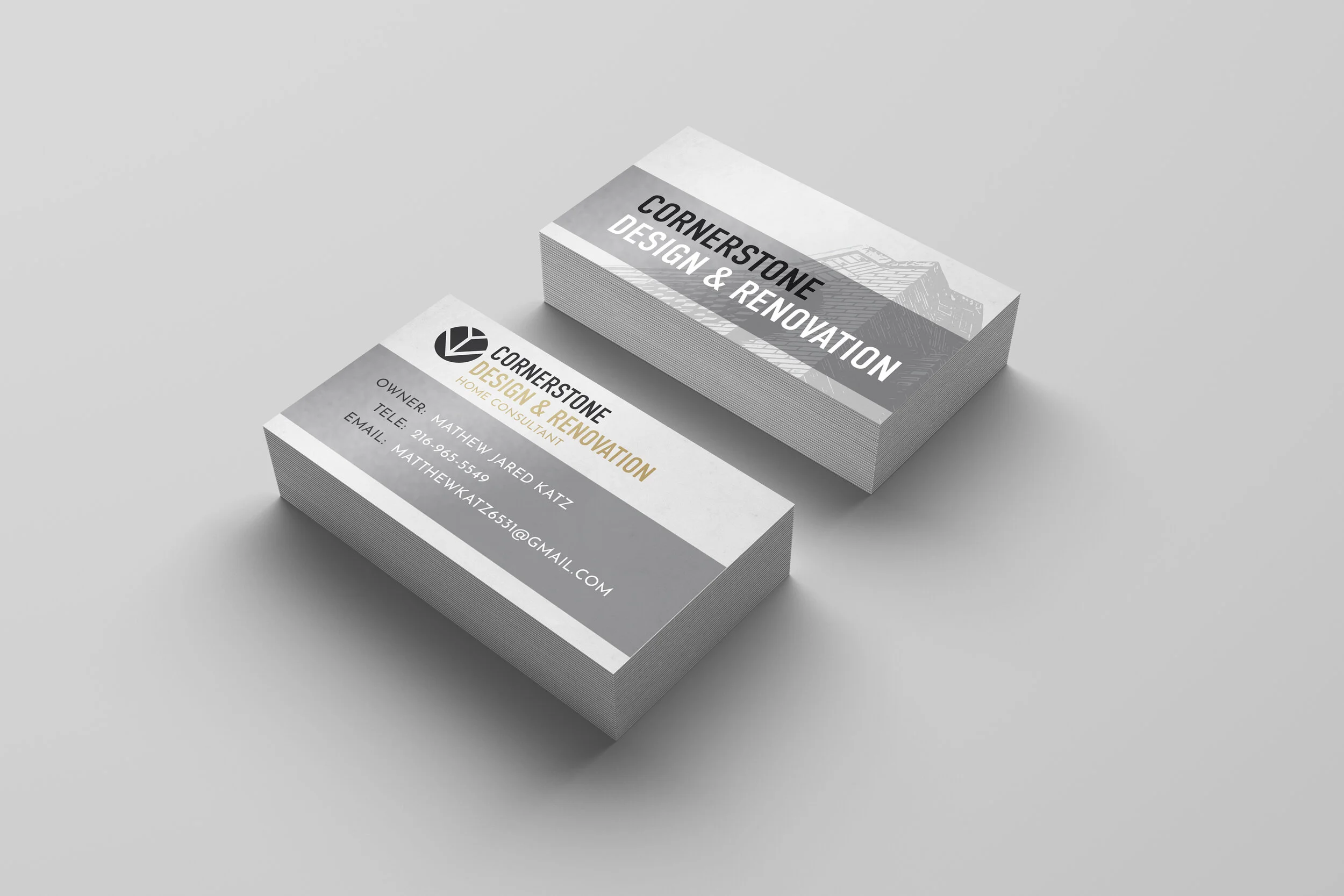
Cornerstone Design & Renovation Branding
I recently completed business card and branding design for Cornerstone Design & Renovation, located in Cleveland Ohio. Cornerstone Design & Renovation is a home consulting business that helps its clients plan for a home renovation. Here, I am talking about the design process I went through to help out their business.
Happy Wednesday! I just completed a business card design, and branding project for Cornerstone Design & Renovation. One of my dear friends, Matt is the owner and starting his own home renovation consulting business. I was happy to help him with the design of his identity.
Final Design
Matt was able to send me some inspiration to pull from, a beautiful stained glass window and some colors on a mailbox. These colors laid the foundation for some of the concepts.
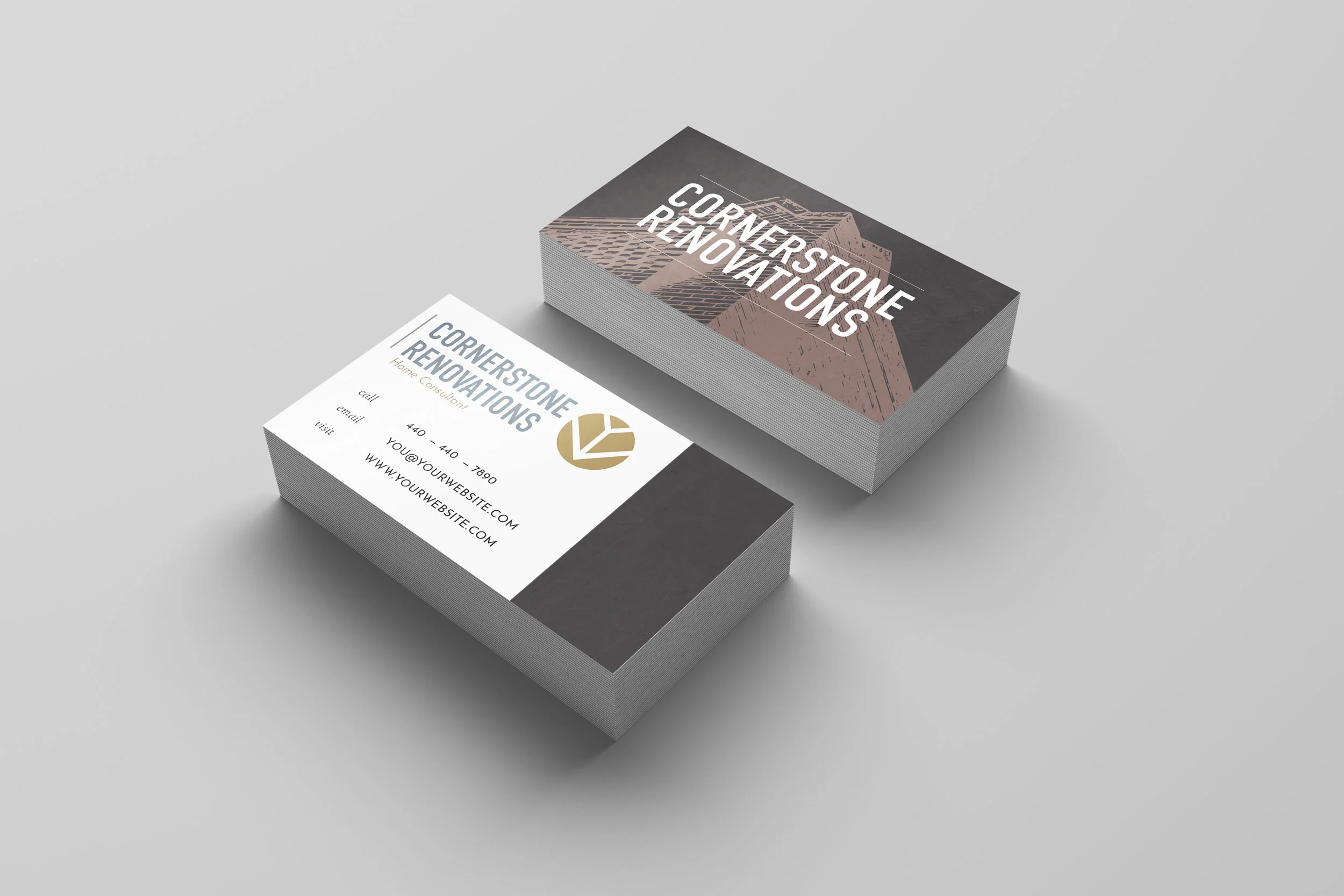
Draft Prototypes
Options are nice, right? When I sent over the prototypes, I wanted to include a variety of options for Matt to choose from. I played with stone textures in the backgrounds, faint but they add a bit of depth and dimension to the design. I also wanted to apply a real world look for how they would look produced, rather than flat graphics so I utilized a good mock up for that.
Early visuals and branding.
Logo
Logo Design
It is important to develop a brand, and a brand can develop over time. I wanted to create a simple logo for Cornerstone Design & Renovation that is clean, clear and easily changeable in typography and color.
Branding
This is some early branding concepts I sent over, and visual research. Ultimately we went with the more graphical corner shown below, which works really well in the design.
If you are in the Cleveland area and are thinking of doing some home renovations please reach out to Cornerstone Design & Renovations for help.
Cornerstone Design & Renovation
216-965-5549
MatthewKatz6531@gmail.com
Hope you all are having a fantastic week!
-Derek
CLVD HAIR STUDIO LOGO
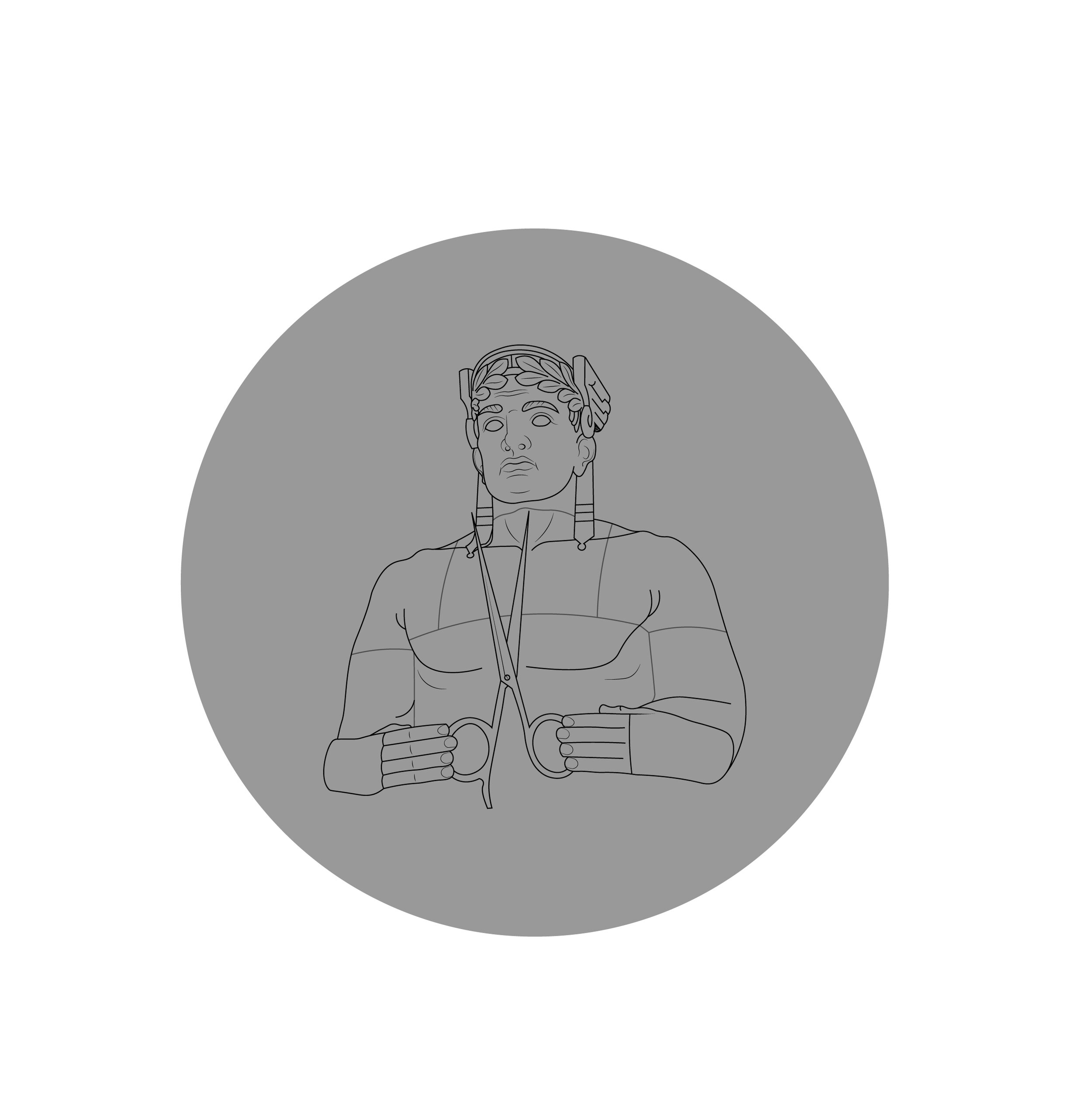
Hello my friends! I am lucky and thankful to have such a nice referral base which brought me to work with Katie at CLVD HAIR STUDIO, located in Avon Ohio. If you all need your hair done and you are in the Cleveland area, please go visit her! Her Instagram is @hairbykatiekim so check her out Cleveland! Overall I really loved doing this project, and I love the Cleveland Guardian statues so it was a win for me. Katie had a clear idea of what she wanted, so it was fun to take her clear idea and make it a reality in my own way.
I wanted the guardian illustration to work in the logo, and on his own as well. I created various icons Katie could utilize on marketing materials, business cards or social media.
Icons
Vertical Logo Version
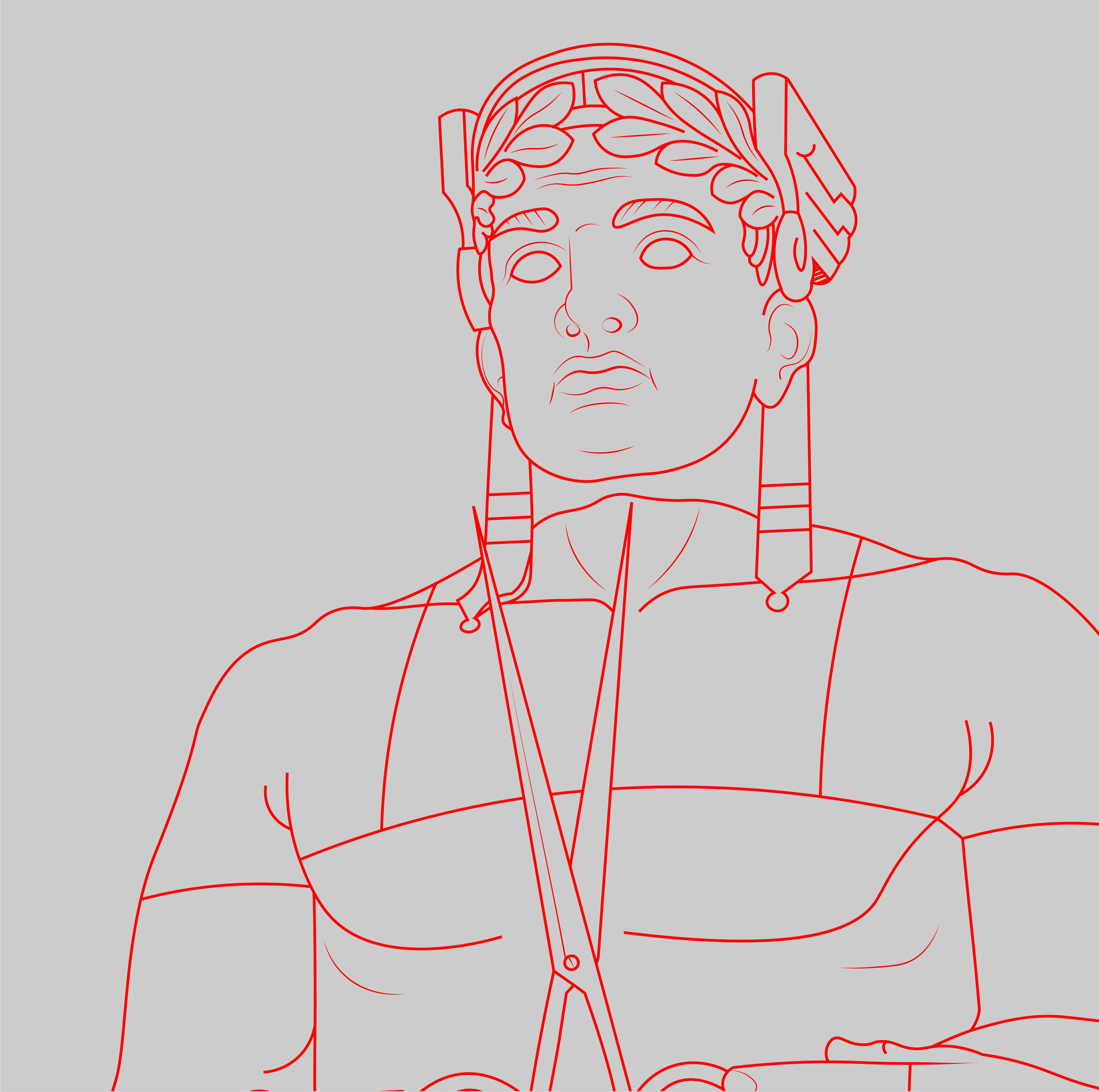
Illustration Details
Illustration details.
© 2020 Derek Prince Wilson of Derekdoesdesign.
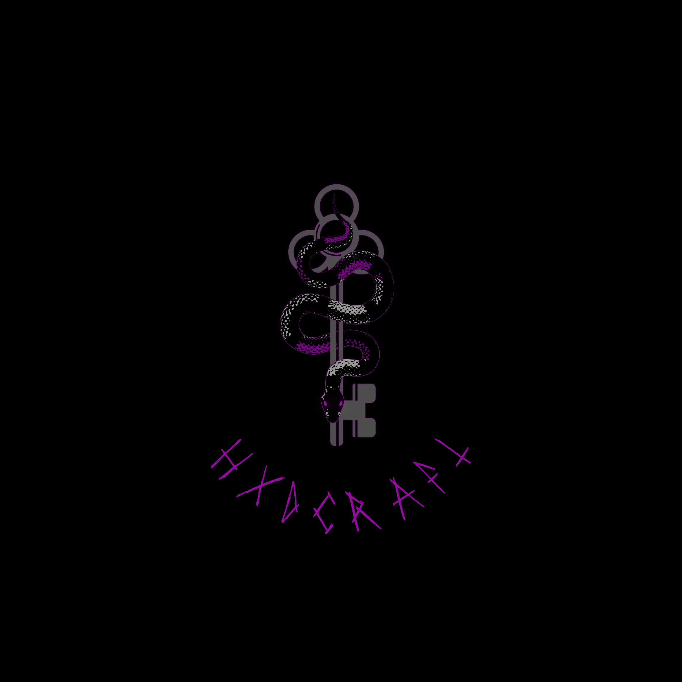
HXDCRAFT Logo Design
Close up details.
I was lucky enough to work with such an awesome client Christa, at @HXDCRAFT. Christa was a designers dream, who gave feedback and had creative ideas of her own, that really fleshed out the logo to be what it became. I was given to main goals for this logo:
A serpent.
A 3 hole key.
The serpent to have red eyes ( which later turned purple)
I did a lot of visual research for this logo. I looked at a lot of 3 looped keys, but my goal was to not have the key the focal point, but the snake around the key. I wanted the key to be solid, but still have character so I cut out shaped to add a bit of dimension.
Reduced size logos.
Early Concepts
Early versions of the logo, I worked in a lot of red to add contrast, which later turned to purple by my client sending me a swatch of purple to try. The purple really adds a nice contrast to the logo itself and I am so glad the client had the idea to try it.


