

Discover Estate Sales: Brand Idenity

Hello! Happy New Year! I am so so so hopeful that 2021 will be better for us all. I have been trying to be busy, working on various projects. My goal for myself this year is to post here on my blog at least every Friday. That is one of my new year goals for myself and I am going to try and stick to it.
I wanted to share this project I have been working on and off on, and actually am really excited for it. Discover Estate Sales is a website that shares where estate sales may be, I believe by location. While the website itself is still under construction, I have been working on the logo and brand identity for it. Here are some of the logo concepts, to refinements, and then fleshing out the brand identity for it. My goal was to keep true to a vintage style, but add a modern twist to the estate sale vibe.
Logo 1st Drafts
These 6 options I sent over for consideration as a 1st round draft.


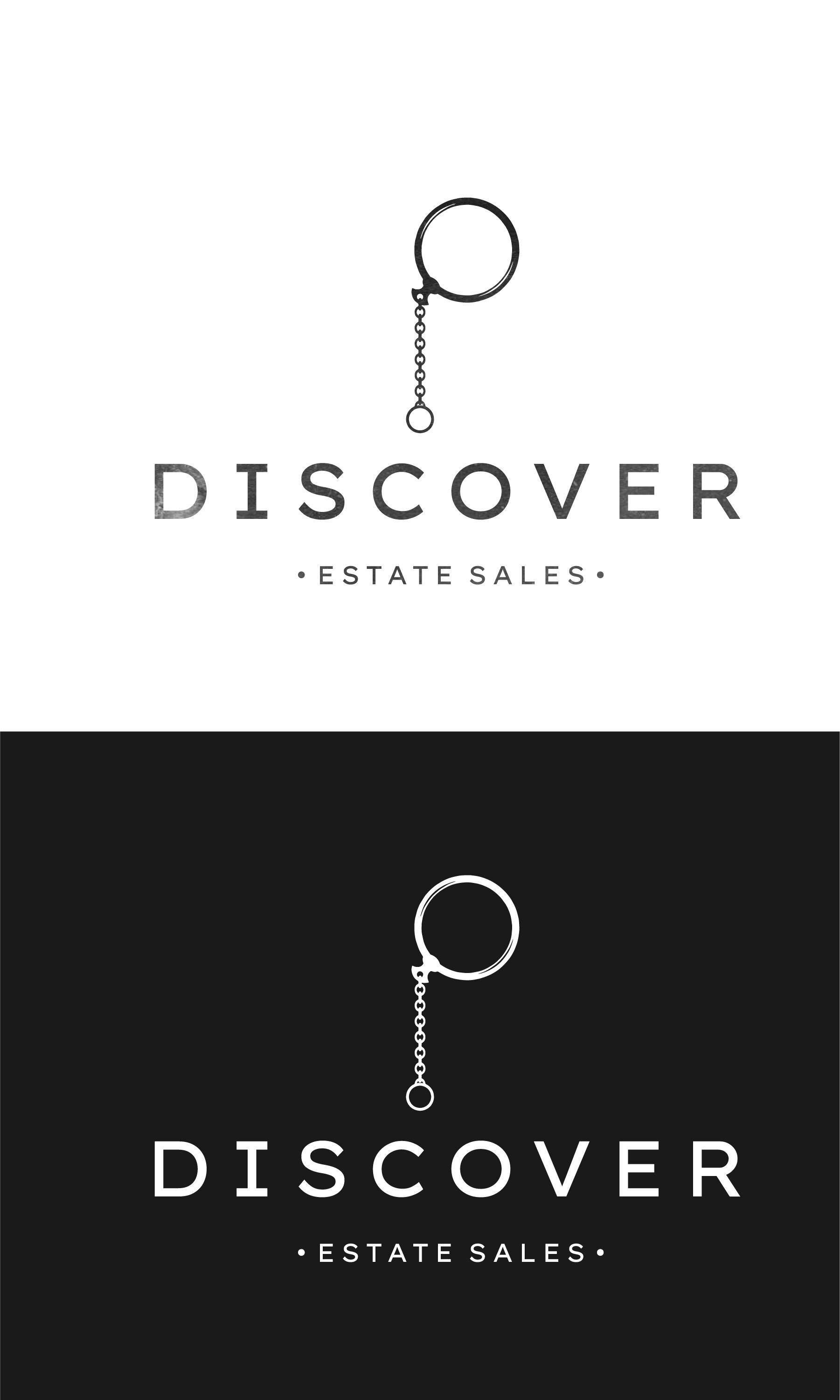
Once I received word that they had chosen one of my logos, I went into refining and fleshing out the brand identity. This included per the client: visuals, color, and slight changes to the original logo they had chosen. The following pages are the brand guidelines sent over to the client.


The brand identity is still potentially subject to change, but I have been having so much fun with it, I wanted to share the progress. When everything is complete, and the website is up, I will post another blog with all of that information so you all can check it out.
Happy Friday, and as I have committed to myself I will be posting a blog every Friday this year so until then!
As always, if you need graphic design work, or know someone who does I always appreciate any referral I receive. Take care!


Hott Tarts Logo Design
Hott Tarts is a Cleveland OH home made pop tart business I created a logo for. The inspiration from my awesome client is the 90’s, and it shows. It brought me back to my slap bracelet, SNES, and capri sun days.
Happy Monday! I wanted to share with you all this fun project I just completed. Hott Tarts is a Cleveland based and owned pop tart company started by my awesome client Michelle. She wanted a 90’s inspired logo, and really wanted the feel of 90’s pushed to the max. I grew up in the 90’s, but I really had to do some visual research, and play lots of 90’s music while getting this feeling right.

Final Logo v1.0
Variations

Pattern Variation 1

Triangle Variation with texture in circle.
Logo v2.0
Overall, I sent over quite a few logo concepts, and these two made the cut to be final logo. The concept behind this one was Neon lit signs were all the rage in the 90’s, so that is where this logo’s idea originated from.

V 2.0

v 2.0 Black
Patterns

Pattern mixed with logo.

Pop Tart Pattern

90’s inspired pattern.
Overall, this project was a TON of fun, and brought me back to my 90’s kid life of slap bracelets, SNES games and Capri Suns all day, every day. Please check out Hott Tart’s and their…
instagram here: @hott.tarts
Website: www.hotttarts.com
Thank you for reading, and as always if you need any graphic design, branding, or illustration help please reach out to me! I would love to help you and your business grow. I have had a BLAST working with other entrepreneurs in Cleveland and beyond, and would love to work with you as well. Drop be a email, and let’s get it started!
Cheers to a good week!
-Derek

